
After seeing something similar elsewhere I decided to give this a go.
Honestly, I thought the top 1% (population the size of Hastings) might reach down to Whangarei or at most upper-upper Auckland, but it’s the visual representation of the top 10% - basically everything north of about Kaikoura - that shocked me the most!
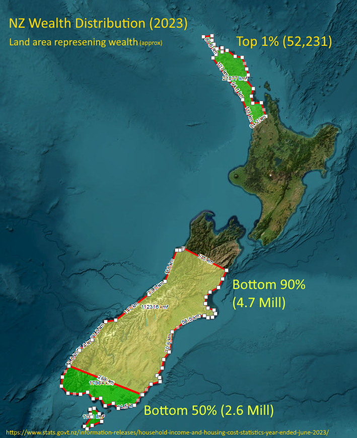
This doesn’t look like. If the top 1% is only 52 thousand people and the bottom 90% is 5.4 million people the areas don’t look right.
The areas don’t reflect the population, it reflects the wealth of that percentage of the population. Using the map is just so fun way to represent the values.
So, bottom of the south is the total wealth of the bottom 50% of the population (2.6m). From Kaikoura north is the wealth of the top 10% with the Auckland/Northland representing just the 1% (around 52k people) who own about the same as the bottom 50%
I get what you are trying to do but it still doesn’t look right to my eyes. Maybe you should have just stuck to bar graphs.
OP, if 76% of NZ’s population live on the north island, how can the bottom 50% live in the south island?
I don’t think we’re unique in the world, this impacts most countries but I believe the average kiwi doesn’t realize how bad it is and so thinks NZ is still a fair-go country.
Caused by dozens of issues over the past 50+ years:
- No1 on my list would be the demonization of unions (deserved in some cases, probably not in most), leading to reduced membership and weakened labour bargaining power
- Gradually shifting tax burden from those who could afford it (thus redistributing some of that wealth into public assets) and onto the lower-earning masses who can’t. By way of policy, tax rates, financial structure (trusts etc)
- Ongoing pro-business policy on the right with compromise worker/business friendly policy on the left
- Requiring business to prioritise profits for owners/investors, without employees having equal footing in this consideration.
- Anti competitive/duopoly businesses in almost every major sector
- All of the above leading to wage suppression
- Nepotism and racism leading to those who go to private schools more likely to land lucrative roles
- Privatisation of national assets. Sold to only those that can afford to invest (amplifying inequality) then once there is a profit incentive, only increases the costs for consumers.
- Govt getting lumped with cleaning up the carcass after private business has bled an asset dry to retain it for the national benefits or to avoid environmental damage (Kiwi Rail, Marsden point)
- Demonization of welfare meaning anyone hitting bottom just gets pushed further into the dirt
- Demonization of any attempts at wealth distribution. CGT increasing the top brackets, UBI etc.
- Low productivity. Shitty businesses run by owners/managers who can’t see past the end of their nose.
- Productivity improvements fought by the labour force because productively gains aren’t shared (less jobs)
- NIMBYism
- Short term thinking by both Govt and voters. Often caused by immediate need as more and more people become desperate and in hardship.
Probably many, many more but in summing up, it’s capitalism, it’s nepotism and racism - it’s the vibe.
if you destroy or weaken the unions the rest just fall in place.
But you forget one important thing. The people who vote for this. People who support this. The people who want this to happen so bad they show up at the polls and vote for parties which make it happen.
None of it could happen without popular support of the willing and the apathy of the rest.
Very interesting take, OP. Can you please elaborate why you think this is the situation for NZ?
https://en.m.wikipedia.org/wiki/North_Island
76% of NZ’s population are on the north island, so I’m not entirely sure how those numbers are supposed to work.
So, what’s your source for these claims exactly, how do we know you’re not just making this up?
Also, population density decreases the further south you go, more or less, so you would always see a lot of wealth in and around Auckland.
You’ve misread the graph (or I didn’t make it clear enough, this was 10min job!)
The land represents all of NZ’s wealth with each area highlighting the proportion owned by each percentage of the population. It is not a distribution of wealth by geographical region.
The source for the data used to build the graph is on the bottom of the image.
The source for the rest of my claims however, many can be found by a moment’s search, some others are anicdotal based on many years of watching news, learning, observing and life experience (hence the mention of the vibe).
Many of these (asset sales, welfare, tax changes, wealth redistribution, NIMBYism, trusts, productivity, union membership, productivity) and their impact on New Zealand and wealth distribution will be familiar to any kiwi who pays attention or who takes an interest.
People much smarter than me have written plenty of articles, published papers and worked through the stats over the years.
So you’re attempting to represent percentages of population and their wealth in terms of the land area covered?
If this is so, i don’t understand whats happening at the bottom of North, and Top of South Island.
Are the numbers in the brackets number of people in that section?
Looks like an interesting design, but it needs a little more work to work well as a quick visual understanding of the data being communicated.
