
After seeing something similar elsewhere I decided to give this a go.
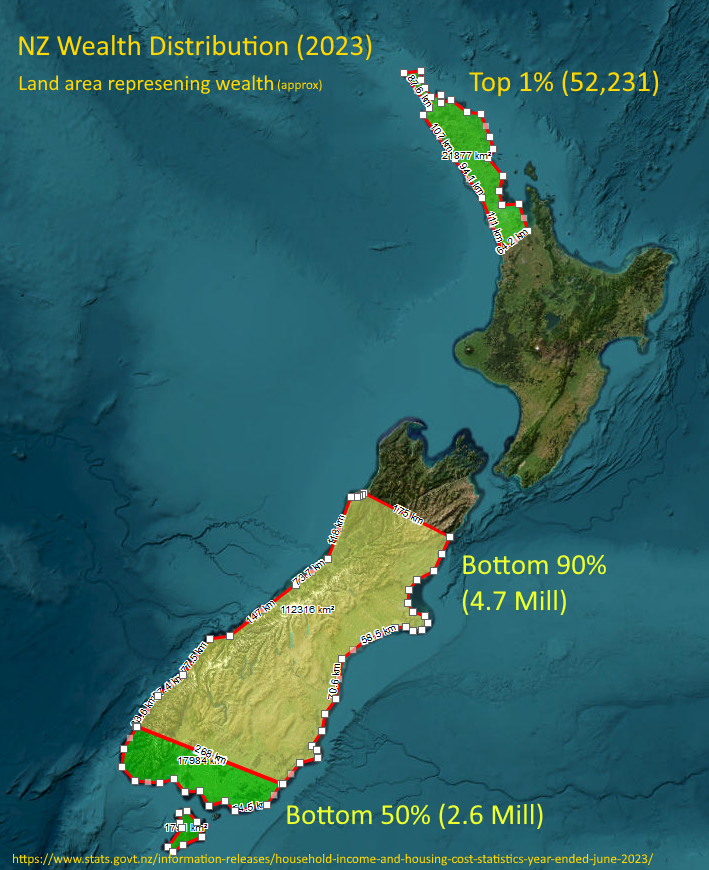
Honestly, I thought the top 1% (population the size of Hastings) might reach down to Whangarei or at most upper-upper Auckland, but it’s the visual representation of the top 10% - basically everything north of about Kaikoura - that shocked me the most!
I get what you are trying to do but it still doesn’t look right to my eyes. Maybe you should have just stuck to bar graphs.