
After seeing something similar elsewhere I decided to give this a go.
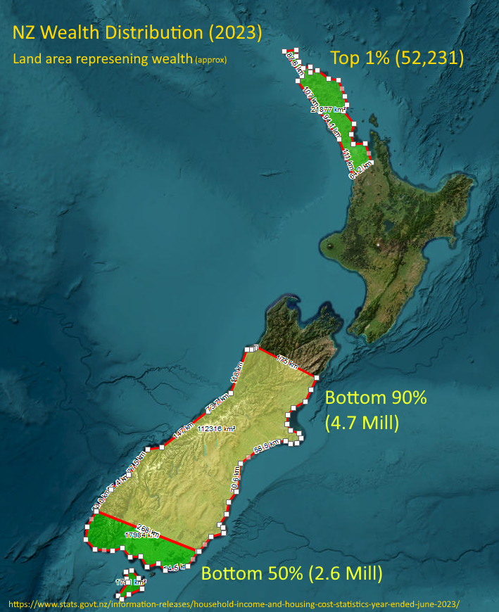
Honestly, I thought the top 1% (population the size of Hastings) might reach down to Whangarei or at most upper-upper Auckland, but it’s the visual representation of the top 10% - basically everything north of about Kaikoura - that shocked me the most!
So, what’s your source for these claims exactly, how do we know you’re not just making this up?
Also, population density decreases the further south you go, more or less, so you would always see a lot of wealth in and around Auckland.
You’ve misread the graph (or I didn’t make it clear enough, this was 10min job!)
The land represents all of NZ’s wealth with each area highlighting the proportion owned by each percentage of the population. It is not a distribution of wealth by geographical region.
The source for the data used to build the graph is on the bottom of the image.
The source for the rest of my claims however, many can be found by a moment’s search, some others are anicdotal based on many years of watching news, learning, observing and life experience (hence the mention of the vibe).
Many of these (asset sales, welfare, tax changes, wealth redistribution, NIMBYism, trusts, productivity, union membership, productivity) and their impact on New Zealand and wealth distribution will be familiar to any kiwi who pays attention or who takes an interest.
People much smarter than me have written plenty of articles, published papers and worked through the stats over the years.
So you’re attempting to represent percentages of population and their wealth in terms of the land area covered?
If this is so, i don’t understand whats happening at the bottom of North, and Top of South Island.
Are the numbers in the brackets number of people in that section?
Looks like an interesting design, but it needs a little more work to work well as a quick visual understanding of the data being communicated.
That unlabeled middle part must be the top 10% (minus Northland which represents the top 1%).
I thought it was a fun idea. People would get the point if the whole thing was coloured and the lines between zones were horizontal, but land area for that would be harder to calculate.
It has nothing to do with population density as far as I can see.
It’s a stacked column that OP has put in the shape of NZ using land area as a percentage of column.
Regional wealth distribution maps look very different.