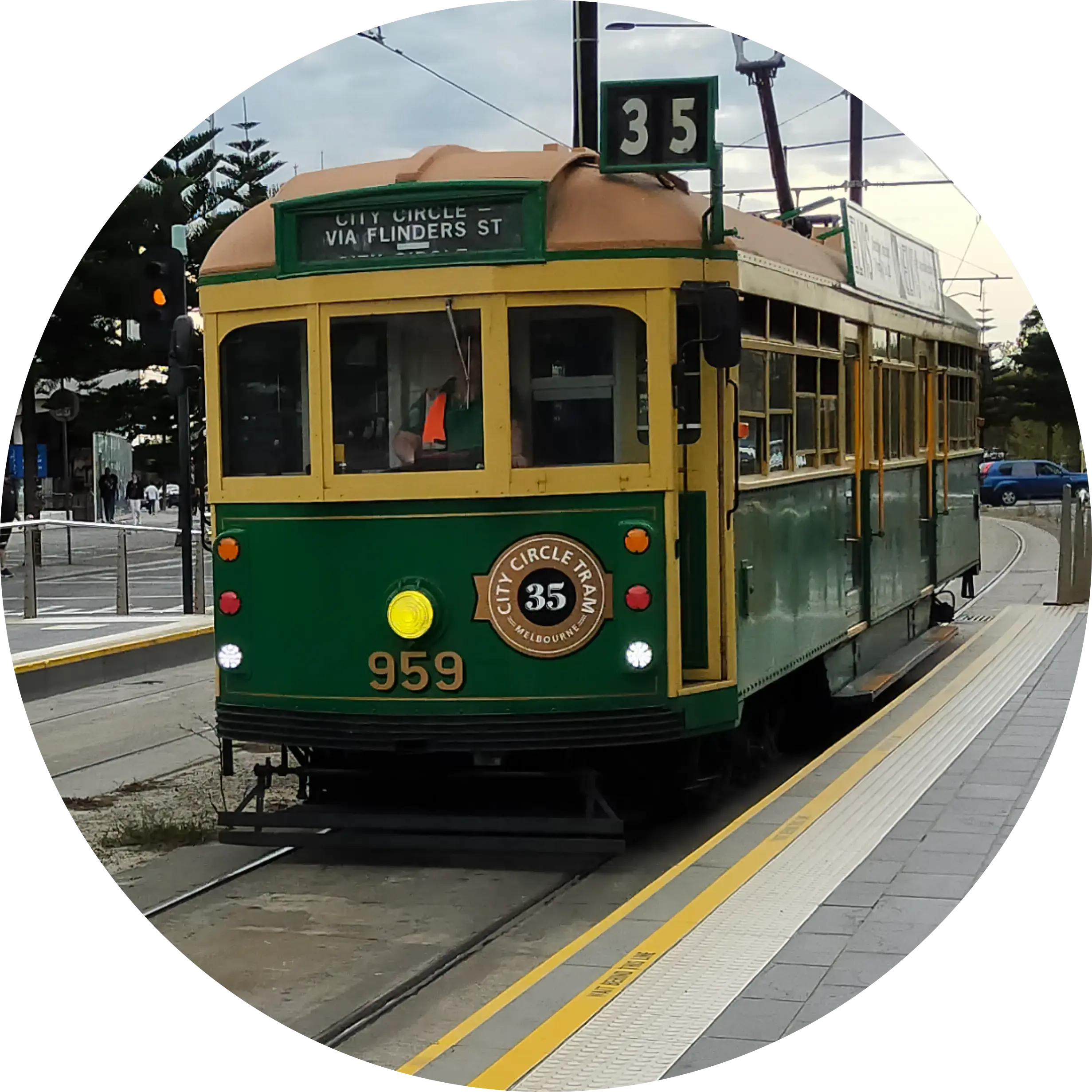
Correct answer: 2011. Congrats to DavidDoesLemmy for getting it! If anybody’s curious about the unredacted map, I’ve posted it here.
I blurred out the issuance date for obvious reasons, but can anybody determine the approximate date from the map design and routes?
Found it in the info book for the hotel I’m currently staying at and thought it might make a good game!
Well it’s got the new design, so it’s not that old. But the 8 and 55 are still there so it predates that “merger”. Can’t recall when it happened, but pre-pandemic is my rough memory, so I’d guess 2015-2019.
The 8 and 55 are the routes that became the 58, right? That one started in 2017. The map is from before 2017
Yep. I’d forgotten when it happened. 2017 makes sense. I also don’t recall when this design happened … I’m thinking around 2015 or so.
Before 2015 too
Ok … yea I don’t recall exactly when, but I recall noticing it when it first came out. It’s not that old though … the design of the maps used to really bad at separating out different lines.
2011
Ding ding ding! How’d you guess?
Dumb luck 🤣
Lucky day! Have a barnstar

Closest without going over? I’ll go with 0001
I’m going to have another look later, but a quick guess I’d say between 2007 and 2017, because there’s no zone 3 and the route 58 is labelled as route 55.
Just noticed the “Etihad Stadium” bit. I don’t know when it was called that, but it might be another clue for someone.
deleted by creator
Random guess. 2012?
Nope
My guess: 2008.
That’s what the network looked like when I moved to Melbourne.Nope - after 2008
Curious now to know what’s different between this map and 2008. I honestly think the 2008 map looked like this.
I was only a few years old at the time and living closer to Adelaide than Melbourne, so I don’t know for sure, but as far as I can find I don’t think it did.
I found a random blog post from may 2011 (a week after the map was published) where somebody compared the old map to the new map. The old map was just yellow, the new map introduced colours. Perhaps you’re getting confused with the yellow only map, or maybe there were some places which had a coloured map before 2011?
Edit: further digging seems to show it was quite a big affair when they rolled our coloured maps, they even repainted trams to advertise the new coloured routes: https://web.archive.org/web/20120216204047/https://yarratrams.com.au/media-centre/news/articles/2011/melbourne’s-new-tram-network-map-revealed
Ahh yeah, I do remember them introducing colours to the maps. No changes to the routes.
Bing says….
If it’s anything like the bus route maps in my area of the world, at least maybe 2010s upwards. The colours te me feel modern because I don’t associate colourful route maps with any other period (since that’s around the decade I started having to use the bus).

