Thoughts on the redesign? I’m not sure how I feel about it yet but I didn’t particularly like the old design so I don’t mind something new. It looks a lot more conventional now, similar to major news outlets like The New York Times, Reuters, Associated Press, etc.
Hm. It’s obviously a more modern design, and I guess the increased focus on categories makes it easier to read news relevant to said category. The redundancy of some sections (e.g. 2x Sport sections with basically the same content) is a bit frustrating since it feels like wasted space - as though the content was forced into the layout, rather than the layout properly supporting the content (though sometimes compromise is inevitable, so eh).
Not wild about how links to other stuff are put before the articles are actually finished. Feels like an attack on my attention span lol.
I do miss a couple of things in the old design, which I doubt will be making a comeback:
- I liked each feed (main feed on left and center, secondary feed on the right) being a single column. I think it makes it much easier to skim through rather than darting both across and down on two columns. Having (essentially) three columns total also feels a bit like I’m being yelled at for attention.
- The varying “priority” of posts was something I appreciated. The new layout seems to have a 2-tier system, but the old one had something like four (?).
As a contrast, comparing this to SBS’ news page (on desktop) and they have a 2x2 for the big stories at the top, but then multiple single-columns for each category, with a clear visual anchor using the heading + image combo keeping each category visually distinct. I find that much easier to quickly skim through to find news that interests me. In this new design I feel like I’m spending a lot more time just moving between things I want to look at, rather than actually looking at them. I’d guess partly this is a side effect of the probably-more-mobile-friendly design, which is a bummer for me because I read on a PC far more often than on a phone ):
It is interesting, as SMH is headed down the same path as news.com.au (at least for A Sydney centric news site) focussing on sport, celebrity goss and going and extra step by locking news behind paywalls and cookies… I am guessing this hasn’t worked out too well for them
I haven’t seen any redesign yet - guess I’m not in the 10 percent.
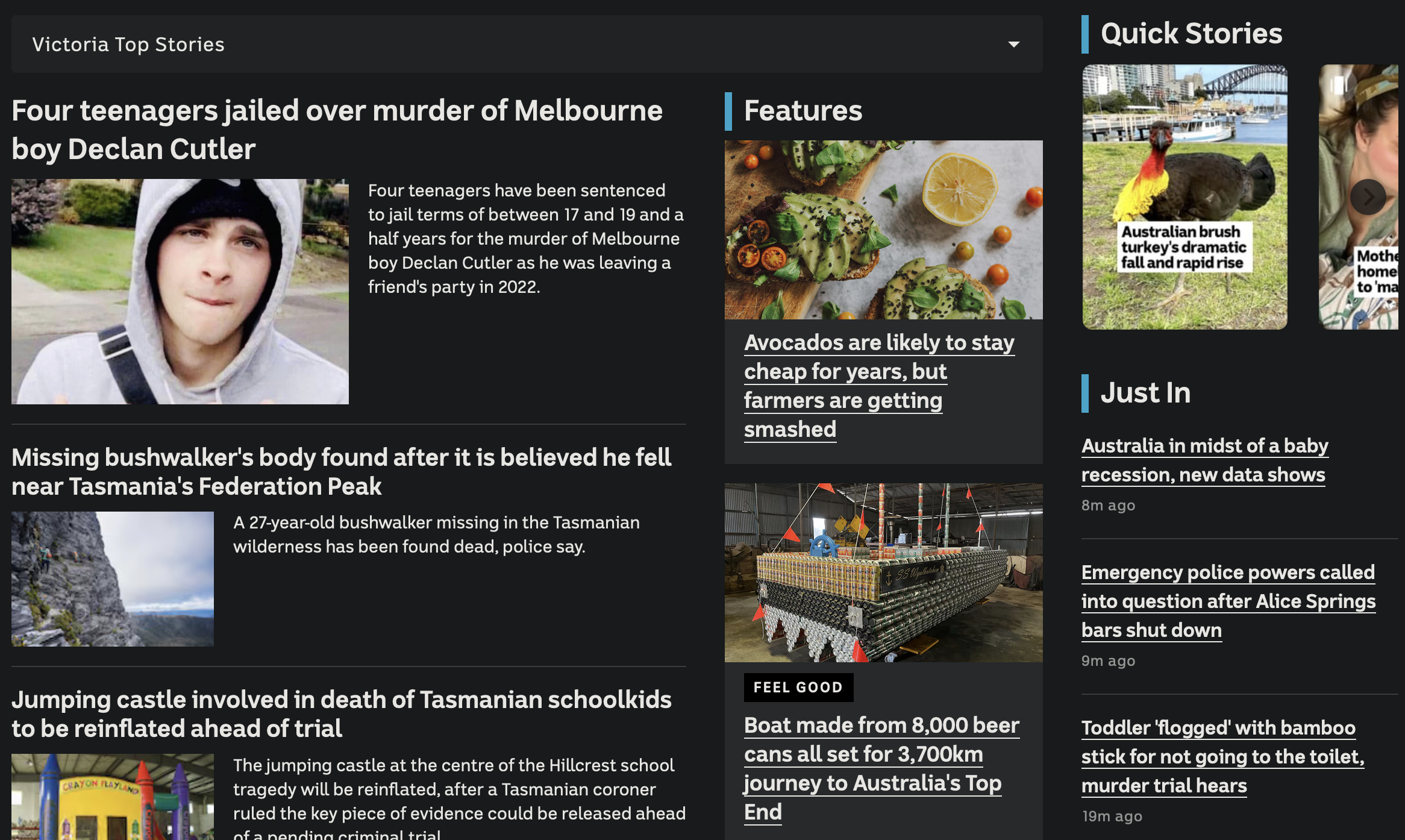
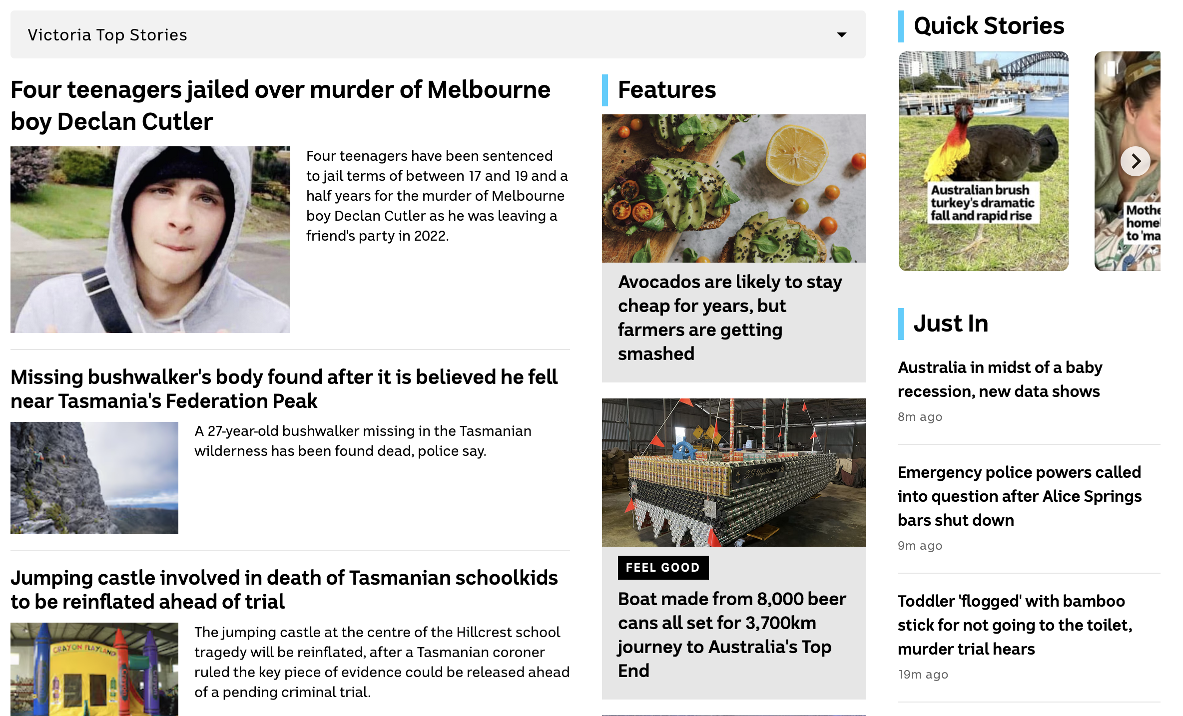
Sorry, I realised after posting that it hasn’t rolled out to everyone just yet. I can see it on my desktop PC but not on phone. Here’s what it looks like:
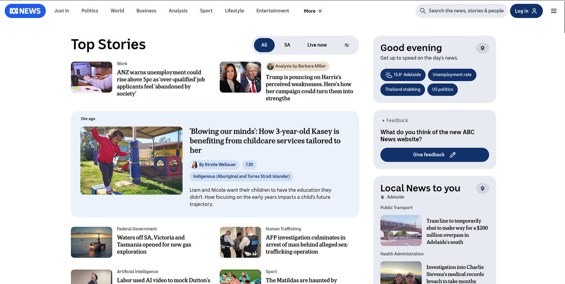
Round corners for everyone and everything!
Seems to be a common design trend at the moment.
Ugh. Not sure its their best move ever. Looks a bit like a cheap Guardian knock off page with the round corner blue boxes.
There isn’t enough use of trapezoidal buttons on webpages. What does the internet have against trapezoids?
Thanks for sharing that. It doesn’t look terrible, I guess. No sign of a dark mode?
I’m not sure. I use Dark Reader and it displays fine with the new design, so you could try that.
Have Dark Reader fixed the problem of not screwing around with CSS? Last time I tried it, it ignored certain CSS and, among other things, links would be underlined. Looked pretty crap on a website like a news site, where every article headline is a hyperlink.
They introduced Dynamic Theming in 2018 to replace CSS filters and at some point that became the default. I don’t recall ever encountering the issue you’re describing.
Yep - still looks shit.
Just testing it now, the Filter and Filter+ theme generation modes seem to fix the issue you’re having.
deleted by creator
did they just rebrand Israeli- blue and white
Still havent fixed the number 1 garbage journalism.