
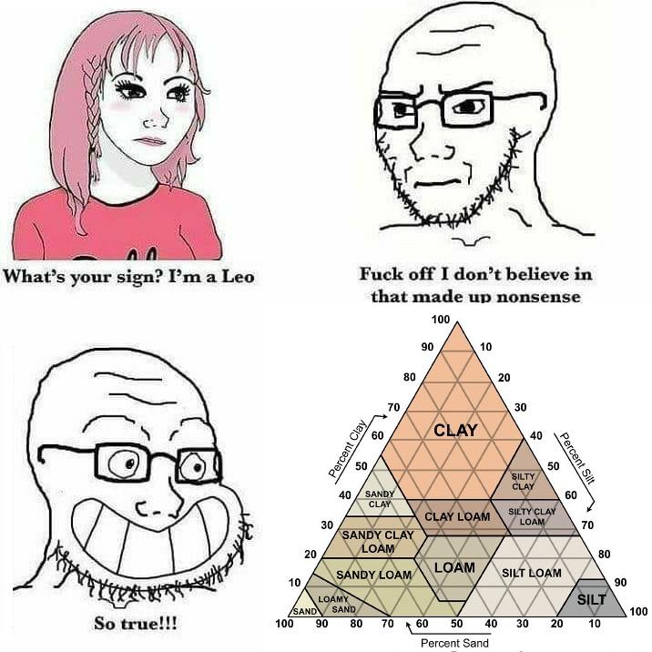
I know that triangle because of Dwarf Fortress
Dig dig dig
deleted by creator
Not a programmer, but all this is is a representation of three columns of data in a table, plus a fourth for the label. Make a lookup table with 4 columns. Now make rows with the data in it, assigning the label for each.
This chart is just a nice way of representing 3 variables in 2D form. It’s just an XYZ graph in 2D. With the constraint that X+Y+Z <= 100. You could even assign functions for those different labels.
Though, me not being very good at maths, I’d have no idea how to write a function to cover those areas.
Probably easier just having a lookup table.
As an example, though, a line going from the top of the triangle to the bottom, in the middle would be:
Clay(silt,sand) = 100 - Silt - Sand, where sand=silt Thus, Clay = 100 - Silt, where Clay+silt+sand<=100 would be a vertical line on the chart.
I think. I’m just having fun trying to work this out, without looking it up now.

deleted by creator
For the people who have trouble reading this chart, I skillfully tried to draw how to read it.
https://fedia.io/media/6f/2c/6f2cffd115c4699b72589a753ebd618a0b818eeb53c28300cc808e69a945786d.jpg
Sorry, I’m illiterate.
if yous illiterate yeh, ows you earin en? euh?
If I print this off and put it up in the Earth science department, will it start a war?
Probably not. I’ve seen this chart in multiple geotech companies. It probably gets pointed at a lot when another contractor goes “but this is obviously sand!”
I’m a Sandy Loam truther.
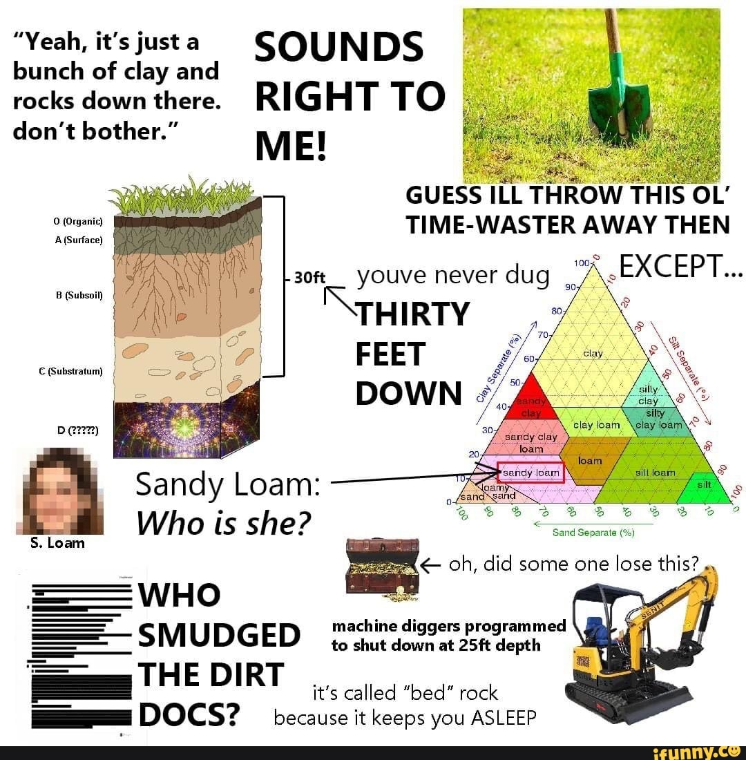
How the hell am I supposed to read this chart? I picked a spot and got a total of 140%, that’s too much soil!
The lines to follow are the ones at the angle that the little arrow points. Which is ‘down and to the right’ from each side if you put that side on top
deleted by creator
Ternary plots (aka Triangle plots) have three axes rotated and layered on top of each other. So when you get a point like this:

You read it as 50% of the way up the clay direction:

30% of the way up the sand direction:

20% of the way up the silt direction:

So it is 50% clay, 30% sand, and 20% silt.
You’re the greatest
pick a junction, follow the line to the left, the top right one and the bottom right one
Who is Sandy Loam, and why can’t I reach her?
You need longer arms.
Somehow I’m bothered that Sandy Clay Loam and Silty Clay Loam are both a thing, but Loam is already the “Silty Sandy Low-Clay Loam” and a the middle-most area is “Clay Loam” instead of pure loam. WHY IS CLAY’S POWER SO GREAT!?
Is this what keeps the soil kingdoms in balance? The two rivals, silt and sand, locked in eternal hatred and yet forced to cooperate to maintain balance against the all consuming Clay Empire?
deleted by creator
My favorite “Big X” thing was something I just found on lemmy recently, it had me laughing harder than it really should have tbh.
“Big Small is just trying to get you to buy more less!”
Areas with loam touch all three sides. So… Some kind of loam exists without sand, some without clay and some without silt. I am not a soil scientist but I’d guess that any substance that contains neither is a kind of loam.
deleted by creator
print it, get a shovel, go dig in dirt.
Not a gardener huh?
It’s confusing that Sandy Loam and Loamy Sand are two distinctly different things.
Dirty water vs. watery dirt.
One is dirty water, the other we’d probably call mud.
To me, the difference is that one is mostly loam with a bit of sand and the other is mostly sand with a bit of loam.
Red orange vs Orange Red.
I love it when you talk dirty to me
Man I’ve gone my whole career without ever dealing with this BS. We use USCS. One time my boss had to deal with it because of some permitting shenanigans with an agency (USDA?) and he said it was stupid.
It makes more sense if you use it as intended. It’s designed to be a simple way for farmers/gardeners to classify the basic soil composition by particle size.
Take a cup of dirt, put it in a mason jar, fill it full of water, put a lid on tight and shake the hell out of it. Come back in 3-4 days and measure the layers.
This comes in helpful in applying pesticides and basic water management. It’s pretty much pointless for anything else.
Wait is dirt triangle a lie?
Why does dirt triangle add up to >100% at all points
Because you need the follow the arrow directions and not just pick them randomly
Cause you’re bad at reading charts
Who the hell is Sandy Loam?
Me playing Dwarf Fortress:


