Compared to the rise of LLMs, containers are positively old hat now
You know, this statement makes the author sound like they think LLMs should replace containers, or that development of better containers is passé because of New and Shiny Things.
Please take care not to sound like a project manager when doing tech journalism.
Plasma is not replacing Gnome in Fedora Workstation.
And it doesn’t need to anyway, the plasma spin works great and there’s no real sign of it being treated as a second class citizen in terms of development/support from the Fedora team.
I think the argument is that since it not the default and not visible in the fedora landing page, the kde spin gets less coverage and hence people are more likely to come across and use the fedora workstation in favour of the kde spin.
Tbh I am fully behind KDE as flagship desktop. Dealing with GNOME users problems all day in the forum, KDE is just better for usability?
GNOME is reduced over the amount that makes sense. KDE could use a bit of reduction, but not as much as GNOMEs. People need the Terminal or random extensions for basic things, this is not a good experience.
On the other hand, GNOME and KDE both have really nice features, GNOME with their Microsoft integrations being particularly powerful (their account system works at all, unlike KDEs which I think nobody uses. But when using Thunderbird, which has standalone Exchange support, you dont use that account system anyways so it doesnt matter again).
Also GNOME has like all their apps on Flathub. GNOME Boxes is particularly crazy, having sandboxed virtualization. This means you can mix match GNOME Flatpaks on a KDE desktop without any problems, KDE even handles the theming for you. On GNOME on the other hand… it actively breaks Qt apps, its insane.
So I think GNOME has some great apps (snapshot, decoder, simplescan, carburetor, celluloid …) but you can install them anywhere.
Dealing with GNOME users problems all day in the forum, KDE is just better for usability?
It seems not unimaginable that whichever is more popular (/the default) will have more people reporting problems in the forum, regardless of how good it is?
Yeah okay. I dont deny that I would also prefer maintaining and QA-ing GNOME over KDE, as its just so much smaller.
But stuff like “there are no right click options for zip” are pretty crazy. Or the total lack of templates by default, for stuff like text files.
GNOME looks better out of the box and configuring KDE can be very tricky. There are also a lot of outdated “addons” for KDE and you need some in order to get what you want. extensions are better integrsted in KDE but it’s not like KDE has everything out of the box. I’d love to see more KDE support.
I think KDE looks great out of the box, includes all the extensions I want, and is easy to configure.
includes all the extensions I want
This is what people dont get. Different DEs best serve different people. We should always push to have a better experience but sniping between DEs makes no sense
That’s good :)
True. KDEs virtual desktops are also basically unusable for me, idk I just dont see them so they are not used.
There are pros and cons. Its simply a tie, I stay with KDE because the lack of some things (like close buttons with the hitbox in the very edge) would annoy me.
This is my issue with KDE. Virtual Desktops are too unnecessarily convoluted to use. Even Alt-Tabbing is a pain if you have anything over 1 single workspace. I decided to daily drive KDE for a few months to give it a good chance, because before I would usually just go back to Gnome after a few days. It’s been 2 months now, and I don’t think I can take much more of it.
Their Plasma 6 overview is great, just needs the panel displayed or even an app menu and it could be similar to GNOME.
I actually tweaked it to be more “gnome-like”, but the desktops are a hot mess. At the end of the day, it’s a matter of taste, and I’m a huge fan of Gnome’s simplicity.
I don’t really get this but I’m going to assume it’s that my workflow is just different than yours.
I have keyboard shortcuts I’m happy with that let me navigate my virtual desktops as desired and place widows on them. If I wasn’t happy with those shortcuts I could change them. I can see having different preferences, or etc, but what makes it a hot mess exactly?
When I Alt-tab it always goes to the apps open on the next desktop, and never shows the apps on the current desktop. So, say I have Vivaldi and KWrite on desktop 1, and Brave and LibreOffice Calc on desktop 2.
If I’m on desktop 1 on Vivaldi and Alt-tab, it’ll move to Desktop 2 and move between Brave and Calc, and but will never show anything from Desktop 1, until I release the Alt key and Alt-tab again.
Now, for me it’s even worse since I have 3 Desktops instead of 2.
I think Gnome is great. I use KDE on my Steam Deck and it’s fine, but very dated and ugly. Looks too much like Windows. Same reason I wont recommend Mint.
Agree on the looks. Even though GNOME is literally a “no blur” macOS clone, which I also dont find really inspired
My father uses a mac and it is plenty different. Maybe the design philosophy of MacOS and GNOME are similar but the implementation is very different.
What is different? I think GNOME diverged a bit more, by removing window buttons, desktop icons, the dock etc. And they dont use blur and transparency at all.
But with dash to dock, blur my shell and some decoration manipulation changer it is very similar.
Not that I dont think this makes sense (I dont, as having a dock but also a top panel wastes space) but it is not really a unique workflow
Removing window buttons ? the trio of buttons for controlling window size ? or is this something else
Yep. And removing the maximize button doesnt even make sense, apart from “looking better”. Not everyone can easily double click I guess
but what. This is completely dumb. How do you do those actions then ?
Well the way the workspaces and the overview work is completely different which means that workflow is night and day different. Not to mention how the differences in how floating windows work, what role the top panel plays and things like that.
They might look similar just like how KDE ‘looks’ similar to windows but that is only true at the surface level. The way the desktops behave and hence the workflow is very different in each case
Okay that may be true. GNOME is very usable (with extensions), macos is hell
I never understand the “Gnome is a MacOS clone” thing.
Other than a black bar at the top which has the time and a few system icons, what to they really have in common?
The workflow is entirely different, the dock is almost always hidden in Gnome, MacOS has no activities view, Gnome doesn’t even use the icon in the top left as a start-menu.
Yes it is MacOS with the dock hidden. And without window buttons. And they are not on the left and not damn colorblind unfriendly.
I mean the top bar is the exact same, the app drawer, the workspaces. The quicksettings. They just removed even more stuff.
Edit: there are many things about them that are different, but the overall design seems similar to me. I think GNOME is way more usable and makes more sense. But still, having a top bar already is kinda odd and I think using that already makes you “macOS like”.
No it isn’t.
The top bar isn’t the exact same, it’s extremely different. Gnome doesn’t use a global menu, doesn’t have a start menu, doesn’t have the clock on the right. The only similarity is the bar being at the top and containing stuff like WiFi and battery icons.
The window decorations are different. The UI looks different. Gnome doesn’t have a permanent dock, doesn’t have stuff on the desktop. Window management works in a very different way, MacOS doesn’t have the activities view, etc.
They are not alike.
Nah Mac OS looks far more ugly than GNOME imo
could become future flagship
Was proposed, but seems unlikely as Fedora/RedHat does a lot in the Gnome eco-system.
Ohy god it took me a full minute to realize that I wasn’t looking at three stylized vaginas.
To be fair, I have seen several neolithic Venus figurines lately.
It’s three fedoras, looked at from the top!
Thank you for making me look, but fuck you for not telling me, it took ages of staring at my screen before I got what was actually depicted.
I had no issues identifying it, and was quite pleased that they actually showed fedoras. People confuse trilbys for fedoras far too frequently.
So far seem to be an uneventful upgrade.
Defaulting to wayland for KDE6 on a nvidia GPU doesn’t seem to have broken anything
I keep finding myself drifting back to XFCE
This is the best summary I could come up with:
The Fedora Project has recycled primary sponsor Red Hat’s old Atomic brand (which the company sunset after acquiring CoreOS), and will use it to group its growing collection of immutable desktop distributions: Silverblue (with GNOME), Kinoite (with KDE Plasma), Sericea (with Sway), and Onyx (with Budgie).
Fedora aims to be the best distro for software developers, and Red Hat’s announcement of the beta highlighted some of the tools for machine learning and large language model development that it will include, including the Python-based PyTorch and version 6 of AMD’s ROCm framework complete with support for AMD’s latest MI300 accelerators.
Version 5 of the DNF package manager, which was held back from Fedora 38 early last year, still didn’t make it in two releases later, but it’s being evaluated in some subsidiary roles.
This is an OS for modern hardware, and while it should perform well, it will want plenty of fast storage and a recent model of GPU, supported by the latest drivers, to do it.
This aging vulture has to perform a web search to check which name denotes which desktop in each Fedora immutable edition, every single time.
If anyone has a hypothesis to explain why distro vendors are so fond of giving their immutable distributions whimsical names, please send in your ideas on a postcard comment below.
The original article contains 844 words, the summary contains 220 words. Saved 74%. I’m a bot and I’m open source!
Trying the KDE Fedora 40 beta spin is what made me switch from a 30-year Windows streak.
All hail compiz 3d cube lol
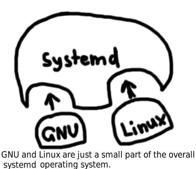
If there’s a spin without systemd let me know.

🙄
I’d try fedora if it had a different name.
Wait, what’s wrong with Fedora? In terms of terrible names that’s pretty low. There code name system used to horrific before the discontinued
Yeah it’s just name bias. I can’t unsee that one particular fedora guy picture when I read it.
I had the same problem when I started to look into Linux distros. Nevermind, I have the same problem in generell. With bandnames, songnames, appnames, packagenames, you name it.
I run with Debian at first because it sounded better than Ubuntu and the logo reminded me of the zerg from StarCraft.
Then I tried a bunch of others, you know how it is, and landet on fedora. Hated the name, still do, but it was the first distro where everything worked. So I’ve been sticking to it since.
Bluefin is basically fedora with a different name.
I miss when it was called Fedora Core.


