This might be just me, but my first impression was the new logo felt more “aggressive”… like the bee is more confrontational by looking you straight into the eye and being ready to attack.
I think I like more the one on @[email protected] profile banner: …with the moustache making it more cartoonish, and less “oh f*ck, a bee is trying to sting me!”.
But again, this is just my personal impression, and some possible bee fobia.


This might be just me, but my first impression was the new logo felt more “aggressive”… like the bee is more confrontational by looking you straight into the eye and being ready to attack.
I think I like more the one on @[email protected] profile banner: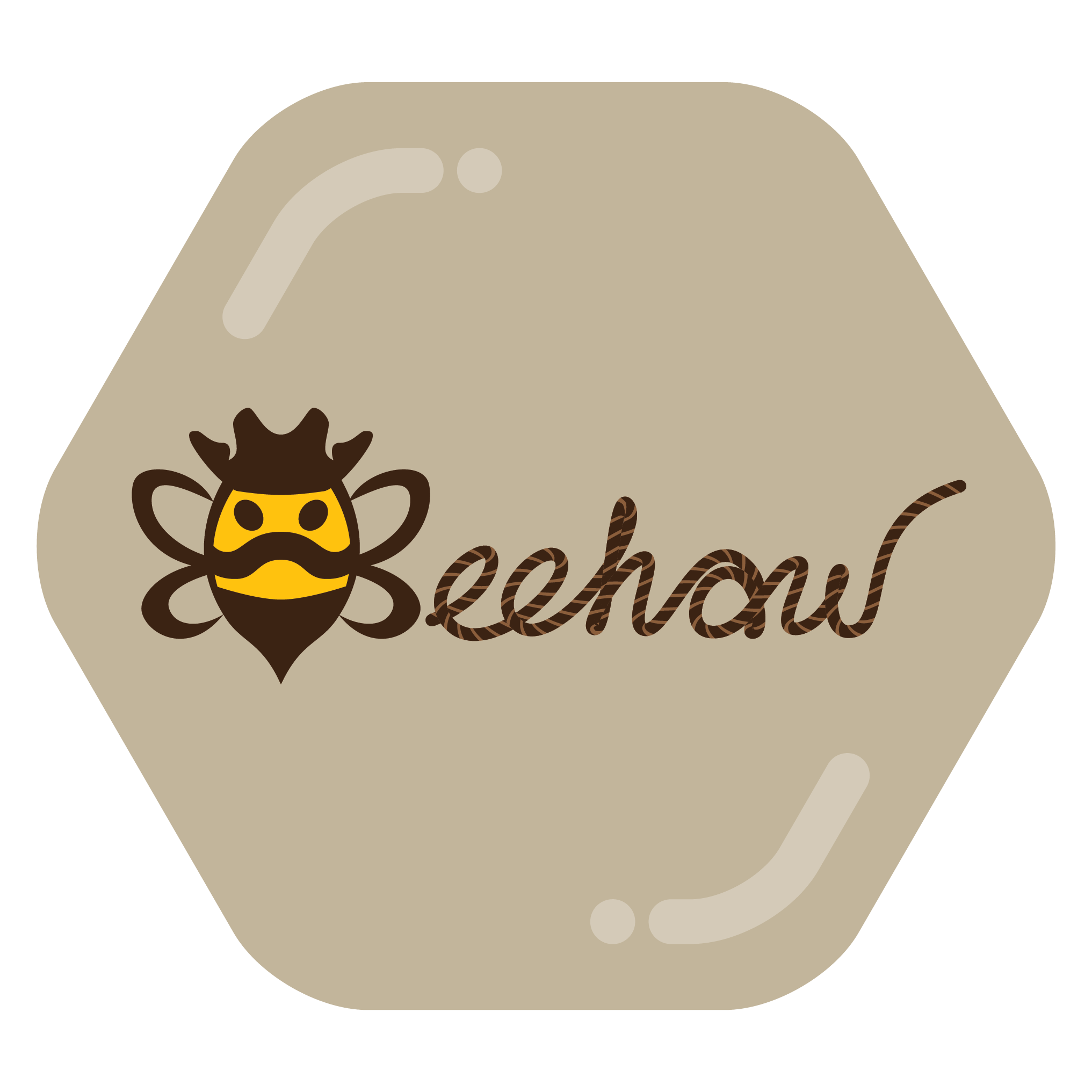 …with the moustache making it more cartoonish, and less “oh f*ck, a bee is trying to sting me!”.
But again, this is just my personal impression, and some possible bee fobia.
I think he looks like he has a really fabulous moustache and a cowboy hat.
Edit. I didn’t realise it was supposed to be a cowboy hat!
I say you have a point. The moustache look makes it more friendly. You can also see the butt/stinger as a bandana!
To me, the moustache reads like a frown, making this bee read as more aggressive.