
You must log in or register to comment.
Couple interesting infographics from the article,
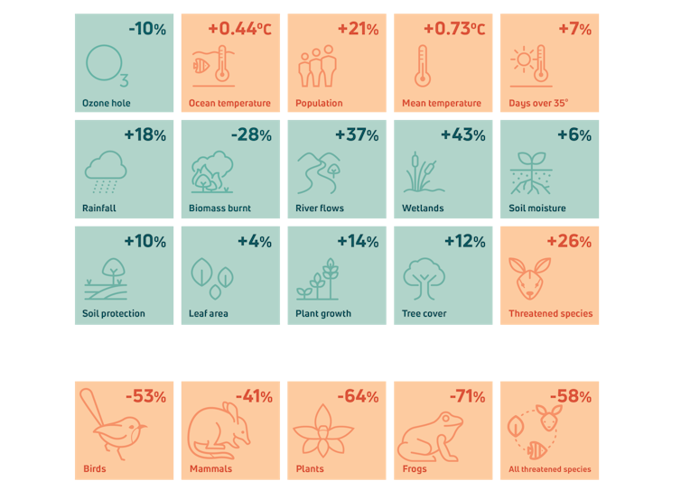
This snapshot shows the environmental score for a range of indicators in Australia. Australia’s Environment Report 2024, CC BY-NC-ND
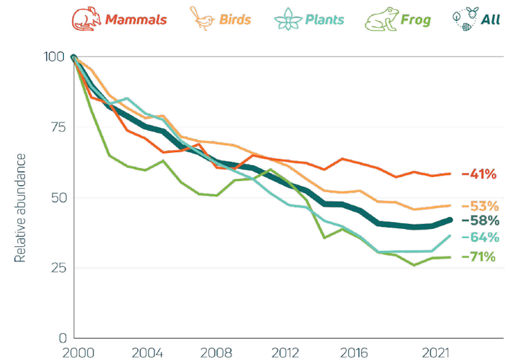
This graph shows the relative abundance of different categories of species listed as threatened under the EPBC Act since 2000, as collated by the Threatened Species Index. Australia’s Environment Report 2024, CC BY-NC-ND
Question: does the second graph only represent endangered species or all species in those categories?
I took it as counting all species in those categories. Didn’t do any digging on it though.