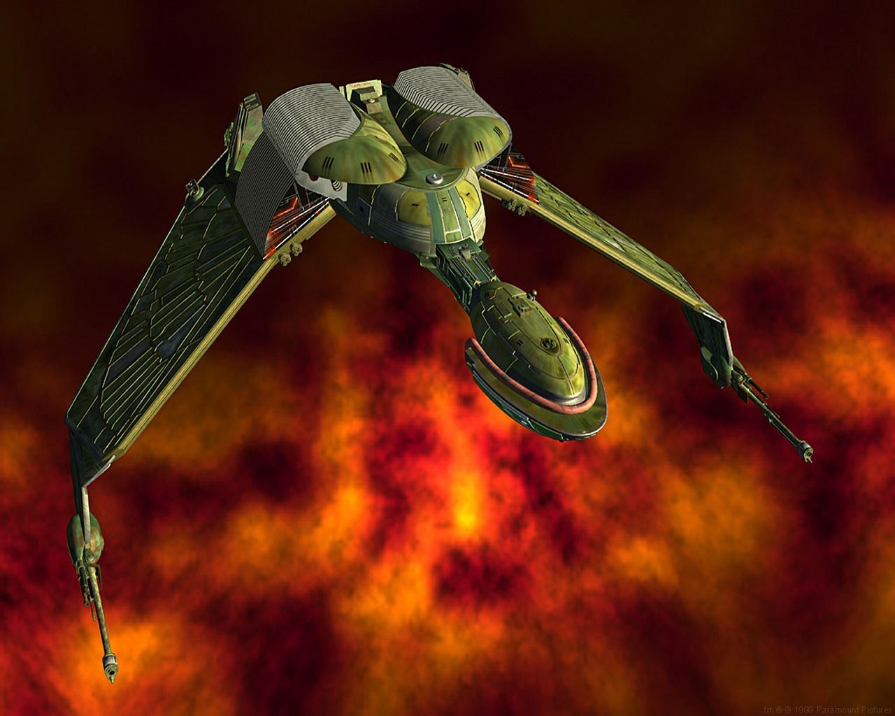
Spotted some great overhead detail shots in VOY s7e14 “Prophecy” and had to share.
Trekhub logo for shits and giggles.
I’m most fond of the traditional NCC-1701, but that’s just nostalgia. I agree the NCC-74656 is in well-designed, sleek aesthetic second only to the B’Rel class Bird-of-Prey.

For Federation ships, it’s certainly the best looking, though. The 74656-A Vivace class is pretty dammed nice, too

My heart will always be true to the 1701, though.
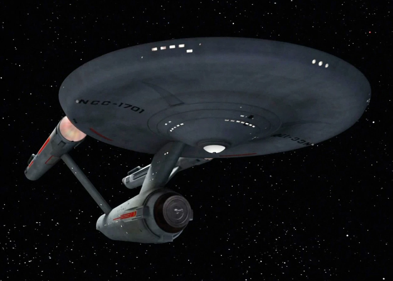
Fair. My first love is the 1701-D (giggity). Grew up with her. The Galaxy class will always hold a special place for me.
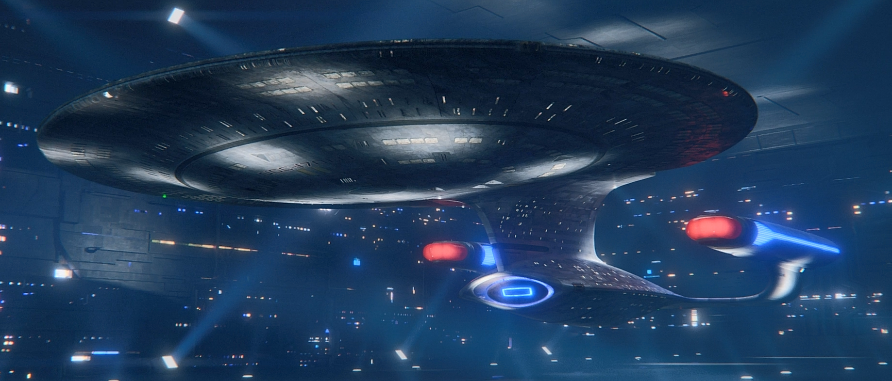
And then there’s Starship Fetish Porn.
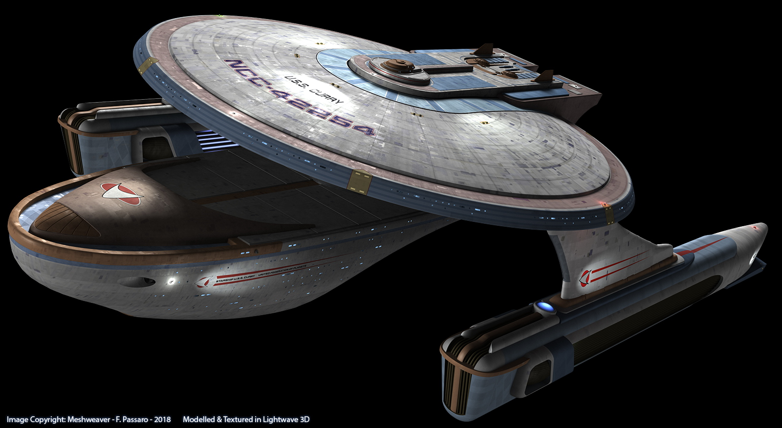
That’s right, Curry Class. Give it to me, you ugly bitch.
Voyager / Intrepid class has always been my favorite. The only thing I dislike (or closest thing to) about it are its ridiculous looking stubby landing struts. lol
The Voyager-A is also quite the beauty.
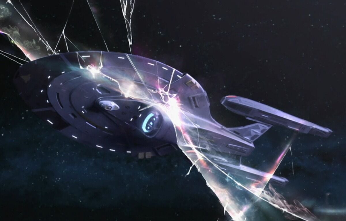
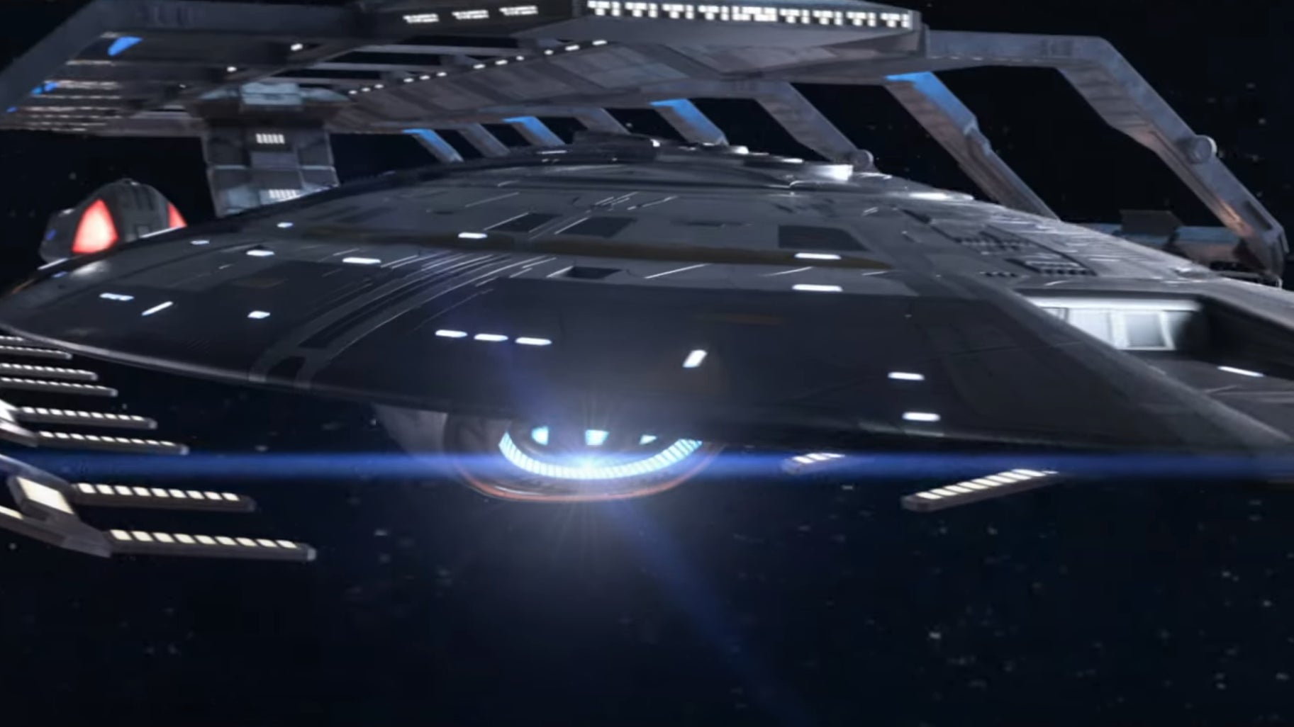
That ship was just introduced into Star Trek Online.

Not a trekkie…why do spaceships need headlights?
They were introduced in the first Trek film to justify being able to see the ship at all:
“And whoever was designing the process of making the visual effects hadn’t really thought about what I was thinking about, which was how do you see the Enterprise when it’s in deep space, when it’s not near the sun or a star or anything? What’s the source of light? Where’s the key light? Where’s the fill light? How are you going to make this thing beautiful? And my thought about it was how to make it light itself up, kind of like the Titanic at night. And make it light itself up by having lights onboard the nacelles, shining on the fuselage, and from the fuselage shining up on the nacelles, and make it look like it’s self-illuminated. So I didn’t have to justify a key light, because there wouldn’t be one. And no one had ever thought of that."
To the the Sovereign class/Enterprise E is just the absolute apex of Federation starship design.
It’s a shame we didn’t get to see more.
Excelsior class is also great.
I’ll just dock myself in cargo bay 3, thank you
