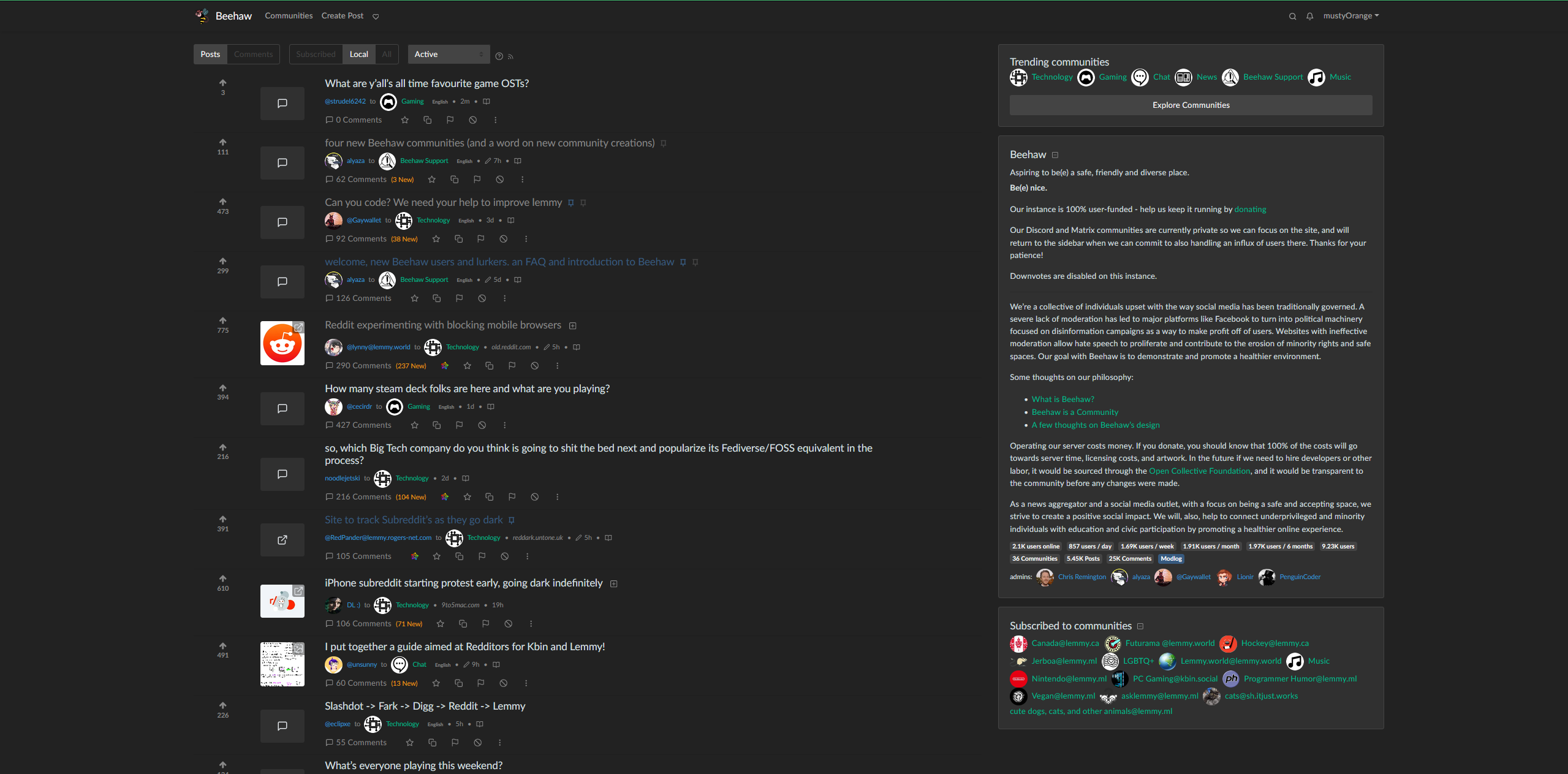
UserStyles Link: https://userstyles.world/style/10309/densify-for-lemmy
Not sure if this is the right community, but the narrowness of the default web page was driving me a little crazy. I still need to fix a few things (like vertically centering the votes) but I feel that this looks a lot better. If you have the Stylus browser add on, you should be able to add it pretty simply!


deleted by creator
Any plans for Beehaw to just fork Lemmy and start applying these quick fixes?
No clue, Im not a mod haha. I hope it wouldnt be too hard to change locally for beehaw - small stuff like this could keep people from going to kbin, which currently has a much better front page ui. Honestly, Im surprised the main lemmy branch has as shitty a front end as it does. Im a back end web dev, and it bothers me, which means it could use a lot of work lol.
The biggest problem though is that i doubt its compatible at all with phones. Not quite sure what the best way to solve that issue would be. Id imagine most mobile users have jerboa or mlem tho
Bless you. Honestly the UI is the biggest thing that’s making trying to stay on this nice community difficult! old.reddit had a UI that felt very comfortable to read, while Lemmy is… less so, for some reason. I hope it improves in general.
Any idea on how to make a compact view? I am kinda new to css and miss old UIs.


