
Why did UI’s turn from practical to form over function?
E.g. Office 2003 vs Microsoft 365

It’s easy to remember where everything is with a toolbar and menu bar, which allows access to any option in one click and hold move.
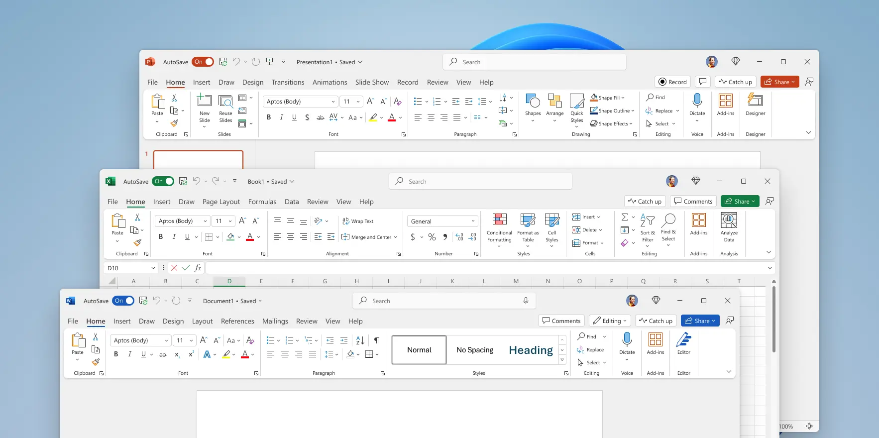
Seriously? Big ribbon and massive padding wasting space, as well as the ribbon being clunky to use.
Why did this happen?
There’s been a trend towards simplicity/minimalism in UX for a long time. Sometimes it works really well. Other times it makes it difficult to find things like setting preferences (or they just don’t implement them because the assholes think they know better than you).
For me, MS is a mixed bag. Some of the UX changes are good, some of it is horrible.
But I love a well done minimalist UX. Obsidian and Reaper are two examples that come to mind.