Someone fucked these up badly and there’s no way to tell from this how.
Are the numbers swapped between candidates but the sizes correct?
Are the sizes swapped between candidates and the numbers correct?
As an aside, this is why serious data people don’t use pie charts. They’re terrible for lots of reasons, one being it’s very hard to compare areas instead of lengths, like a bar chart, as demonstrated by how many people didn’t notice these were so bad at first.
If you see data presented in a pie chart you should immediately be suspicious that it’s dishonest or incompetent.
None of that is to take away that voting for third parties this election is a terrible move - just saying this chart is useless.


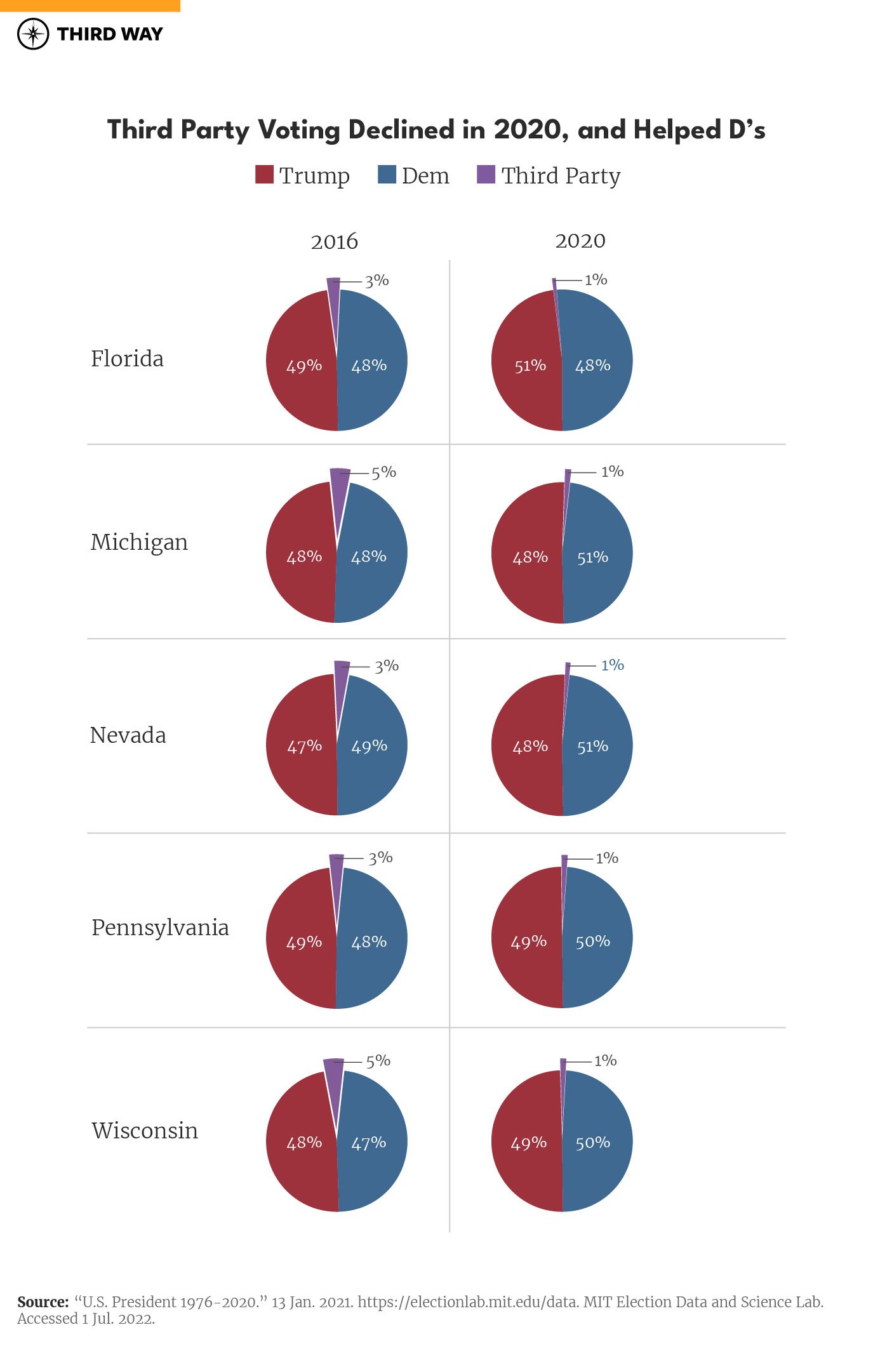
Someone fucked these up badly and there’s no way to tell from this how.
Are the numbers swapped between candidates but the sizes correct? Are the sizes swapped between candidates and the numbers correct?
As an aside, this is why serious data people don’t use pie charts. They’re terrible for lots of reasons, one being it’s very hard to compare areas instead of lengths, like a bar chart, as demonstrated by how many people didn’t notice these were so bad at first.
If you see data presented in a pie chart you should immediately be suspicious that it’s dishonest or incompetent.
None of that is to take away that voting for third parties this election is a terrible move - just saying this chart is useless.