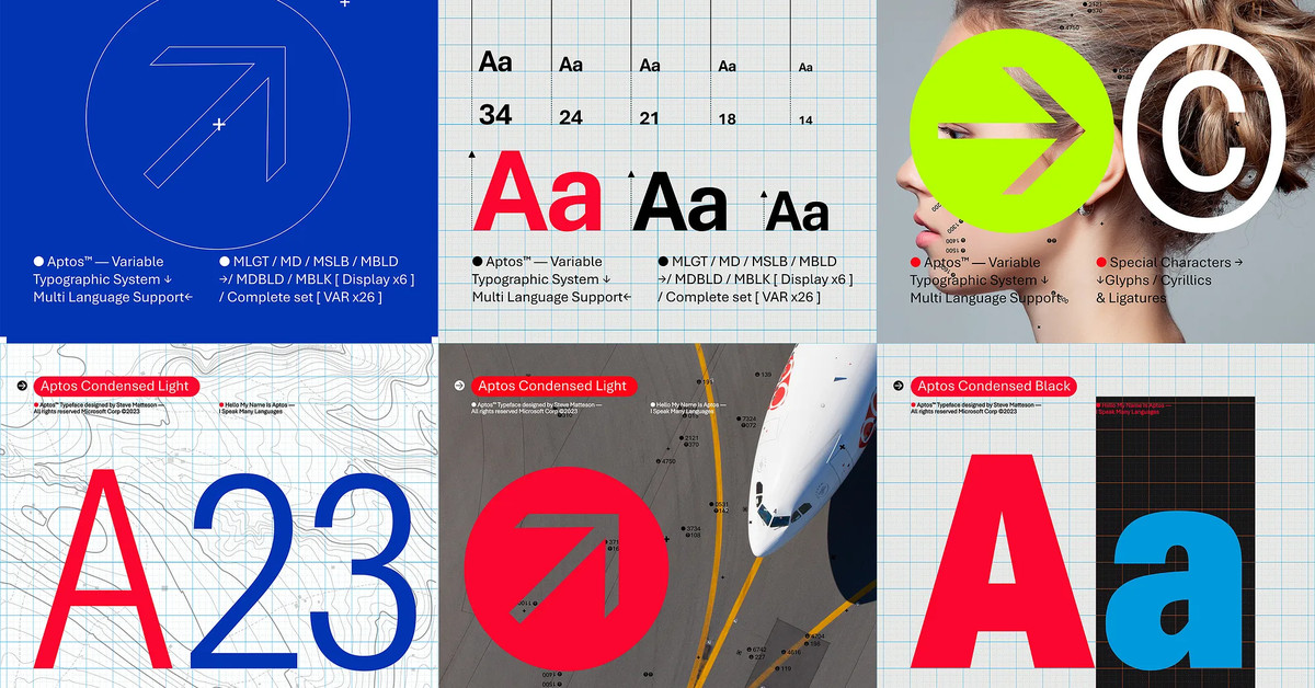
“Today we begin the final phase of this major change where Aptos will start appearing as the new default font across Word, Outlook, PowerPoint and Excel for hundreds of millions of users,” explains Si Daniels, a principal program manager at Microsoft, in a design blog post today. “And, over the next few months it will roll out to be the default for all our customers.”“Today we begin the final phase of this major change where Aptos will start appearing as the new default font across Word, Outlook, PowerPoint and Excel for hundreds of millions of users,” explains Si Daniels, a principal program manager at Microsoft, in a design blog post today. “And, over the next few months it will roll out to be the default for all our customers.”
I’m not sure I understand why they want to replace Calibri, but I guess a fresh typeface every now & then isn’t a bad thing.
What do you all think of this Aptos?


Thanks for the explanation.
I’ve long used (and preferred) san serif typefaces for screen interfaces and find them acceptable for the shorter passages associated with screen-based communications. I still switch out to serif fonts for anything that will be printed out and usually do the same for on-screen reading of books and magazines.
Sans serif on paper just looks wrong to me, unless it’s some kind of heading, in which case I tend to prefer it. Maybe that shows my age. :)
No I get that as a Palatino lover