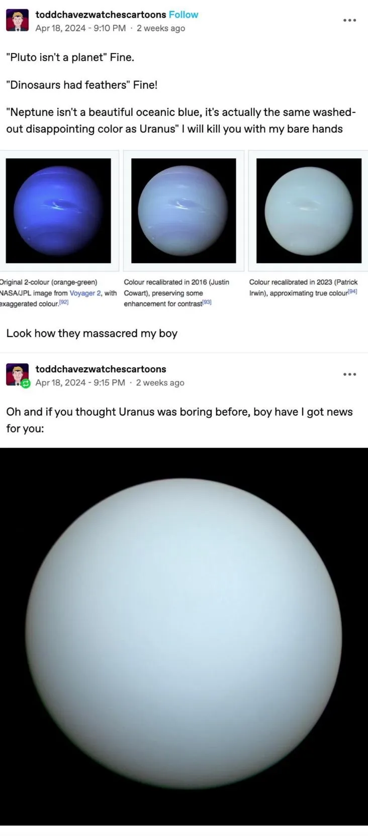
To add to this, we apparently always knew. The famous blue image is more or less the correct hue, but the saturation has been absolutely blown out like a clickbait youtube thumbnail in order to show faint features more clearly. Somewhere along the line we stopped mentioning that that had been done. Irwin and co just just re-calculated it to get the most accurate version yet, because we’ve got a lot more data to work with now than we did back when Voyager 2 did its fly-by
Sort of? My understanding from reading a handful of articles is that Neptune has a bluish haze layer that’s absent on Uranus, but it’s fairly subtle and the overall color of both is a pretty similar frosty light green. So it’s not just that it got oversaturated but that that particular blue hue got applied to the whole planet and not just a thin layer.