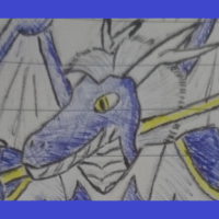
By me~
This is a large homebrew that has the primary goal of allowing you to play as actual true dragons in a DnD setting without being unfairly overpowered.
To accomplish this…
A) I’ve included some guidance on how to better balance high level content
B) I’ve designed eight dragon-only classes, which are equivalent in power to the existing bard and wizard classes.
C) I’ve re-introduced a simple mechanic that allows martial characters to function much more effectively in combat; Flat Damage Reduction.
D) I’ve playtested it and refined it constantly for months
Also it contains a few new feats and spells that are suitable for use by humanoid characters! Complete with my personal guarantee that all of this stuff is at least as well-balanced as basic 5th edition DnD.
It’s not necessarily your fault because it’s the way it works in 5e, but I find the mounting rules are a bit janky: the dragon and the rider get to roll separate initiative, but match their initiative the moment the rider gets on top of the dragon, with some edge cases when the two get separated or the dragon gets mounted mid battle.
I propose a far more elegant fix: the two roll their own initiative and act during their turn, as usual; while mounted, the rider moves using the dragon’s speed, but during the second turn (either the dragon’s or the rider’s, depending on who went first in initiative order), the players must subtract from the dragon’s speed the movement it did during the previous turn (so, for example, if the rider moves 20 feet forward using the dragon’s speed; when the dragon’s turn comes, it can move 20 feet less than its total walking speed, because it has already moved 20 feet this round).
This way, you only need to keep track of the movement; turn order remains unchanged. I know it’s a divisive opinion, because some players may find it easier to move the initiative rather than writing down how many feet the dragon walked in a given round; but it could be worth having it as an optional rule. It’s how I run it in my games, and I find it a lot more elegant than having the mount’s turn swing up and down in initiative count whenever someone gets on top of it.
This is such a good piece of homebrew, oh my God.
I’m only 1/4th way in and I’m loving it so far. I especially like the DM’s tips, insight about balance philosophy and reasoning behind certain choices, and the extensive changelog at the bottom of the document. Really helps me better understand how to look at the class and evaluate it.
The only point of detriment is that the format you chose, that of a Google docs that is, is really hostile for such long brews. I would recommend switching to homebrewery or GM Binder. You could turn those 100 pages into a 30-ish page document very easily, and it would be much more digestible for people to read.
(Btw, I remembered your username from that discussion about dragons, and I agreed with you back then. Despite their prominence in fantasy imagery, they are really underutilized as character companions or as a playable race. I’m glad to see your passion for the topic translated into this!)
Ah! This is really helpful criticism/feedback, thank you so much. I haven’t used those sites before, but I would be happy to give them a shot because I know that this is a very large homebrew that can take a lot of effort to process.
And I’m so glad to hear that you like my creation! Stuff like that really makes the effort worth it
Thanks a lot for undertaking the effort of translating the entire class into homebrewery! It’s a lot of work, but it really helps making the class more readable. I also love how you used notes/descriptive text to distinguish between the “actual” text from your opinions/guidance.
I think it needs a bit more clean-up, but it’s a solid base to start from. A few nitpicks:
- There are some occurrences of the text wrapping up outside of the page border (I counted four: pages 12, 25, 35, 37).
- When listing the class features, make immediately clear at which level each feature is gained. For example, at page 12, Dragoncrafting is a 14th level feature, but nowhere in the feature is written that; I have to go back to the Artisan table and look for Dragoncrafting to see at which level I gain that feature. Also, I recommend adding a “feat” feature at the appropriate level, to make the feature list complete without the necessity of going back to the class table every time.
- Some features refer to the class level as 1-10, while others as 11-20. Artisan’s Force of Genius is unlocked at 5th level, and Hoardbearer at 7th; Scalecrafter’s Infectious Power at 4th, and Cyramerthian’s Manifest Magic Item at 1st; conversely, Planar Tailor’s Reality Rift is unlocked at 11th level, and Dimension Ripper at 14th. I haven’t read all the classes yet because I’ve had a distinctely lack of free time as of late (I’ll be working on it throughout the following days), but a quick scan reveals that the other classes share the same problem: Basara’s Basara Spellcasting feature refers to “levels 1, 3, 5, 7 and 9”, but the following features are unlocked at 13th, 14th 15th, 17th and 19th level; Lorekeeper unlocks its features at 15th and 20th level, but the Annihilator at 1st, 5th and 10th.
The following are suggestions and personal opinions: they should be treated as such and can be discarded if you don’t agree with them, no offence taken.
- I would suggest using less headings when possible, to reduce the visual clutter. For example, in the Dragon Template chapter, you used “Race: Dragon” as a title, and all of its features are in bold, which is visually pleasing; by contrast, when you list the three archetypes, each feature has its own heading, which makes the page a lot messier. If “hit dice”, “martial natural weapons”, etc… were bold text below the “Martial” heading, it would be immediately clear that they are the features of that specific archetype.
- Also about headings, I would suggest cleaning up the h# used for the classes and subclasses. In Tasha, the headings are used as follows: [h1] the artificer; [h2] Class features; [h3] Magical Tinkering, Spellcasting, Infuse Item, ASI, Flash of Genius, etc…; [h2] Artificer Specialists; [h3] Alchemist; [h4] Tool Proficiency, Alchemist Spells, Ecperimental Elixir, etc… . Conversely, in your document you used [h1] Lauth; [h3] Conclave Training, Lauth Spellcasting; Breath, etc…; [h1] Lauth Subclasses; [h2] Hidecarved; [h3] Runic Resistance, Blinding Speed, Mystic Plating, etc… . It’s not a big deal, mind you, but using an h3 for the subclass name and h4 for its features, instead of h2 and h3, helps making immediately clear that the subclasses are a subsection of the main class, instead of their own thing, and reduces the visual clutter. It’s important for all homebrews, but especially so with very big documents such as this one to keep formatting consistent and helping the reader as much as possible with understanding where’s what on a quick glance. From personal experience, the harder a class is to read, the more probable is people to walk away from it. I always try my best to avoid that.
- Homebrewery allows for hyperlinks, which can help with directing the user to other pages when necessary. For example, the Artisan’s Dragoncrafting feature recites “See the bottom of the document for my rules on crafting magic items”, which could be replaced with a hyperlink to page 52. In the archetype selection, the player must either take two ASIs or choose two Feats (or a combination of the two), but it’s not immediately clear that the dragon’s feat list is different from the humanoid’s: a hyperlink to page 48 for the rules pertaining feats and the list of feats available to dragons would do wonders.
- I’m pleased to see that the Sample Characters chapter has been flashed out a bit more! I would suggest making some details about the characters more immediately visible: instead of having to scan the text to see the colour and gender of the character, you could add that to the heading (for example, instead of “Ancetica” you could use “Ancetica, Black Dragoness”). This idea came to me after I spent a good 5 minutes trying to look for the colour of Kirettenne, before realising that the information was nowhere to be found :P
For example, THIS is what I came up with, although you could certainly improve on the design or alter it to your liking. I added the archetype and the colour to the heading, alongside the character’s name, because it allows the reader to immediately discern the most important aspect of the character. I’m not sure if you’re done with the chapter or if you plan on working on it still, but in case, I’d suggest adding additional info such as AC, HP and Speed to make it possible for the player to pick the character and immediately run with it.
Very interesting and extensive work, thank you for sharing!
You’re most welcome! Please let me know your thoughts if you have any, because I’m invested in making this the highest quality I possibly can. Dragons are my favourite part of the game and I would love for them to become a bit more commonplace.


