I think something like this would make U.S. citizens feel better about taxes in general, since it can sometimes feel like you’re throwing a large portion of your hard-earned money away.
The data to create this is essentially public with budget bills right? It would just take building a percentage tree and categorizing them appropriately. I might look into how complex this would be to build.
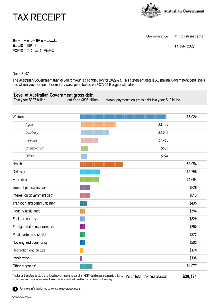
its basically just proportioning out the nations budget against the amount of tax paid,assuming you had access to how much was spent where by category, it would be a peice of piss to make
Mind you the largest chunk of that is the elderly with the unemployed being one of the smallest ones. I’m very much in favour of both by the way.
If you think your taxes are too high then it’s not because too much is going to welfare; it’s because too much is going to tax breaks (which won’t show up on a chart like this) for fossil fuel companies and the wealthy.
Most in Australia don’t read where the money goes. Taxes aren’t too bad (IMO) and the system is so easy that once you submit you don’t really go back to see where it went. Or maybe I live in a bubble.

I think something like this would make U.S. citizens feel better about taxes in general, since it can sometimes feel like you’re throwing a large portion of your hard-earned money away.
The data to create this is essentially public with budget bills right? It would just take building a percentage tree and categorizing them appropriately. I might look into how complex this would be to build.
its basically just proportioning out the nations budget against the amount of tax paid,assuming you had access to how much was spent where by category, it would be a peice of piss to make
Luckily they even do the categorization and calculate percentages for you!
https://www.usaspending.gov/explorer/budget_function
I had no idea this existed; thanks for the share!
true but seeing how much goes to welfare might make republicans hit the roof. Everyones got that uncle that hates the poors.
Mind you the largest chunk of that is the elderly with the unemployed being one of the smallest ones. I’m very much in favour of both by the way.
If you think your taxes are too high then it’s not because too much is going to welfare; it’s because too much is going to tax breaks (which won’t show up on a chart like this) for fossil fuel companies and the wealthy.
Most in Australia don’t read where the money goes. Taxes aren’t too bad (IMO) and the system is so easy that once you submit you don’t really go back to see where it went. Or maybe I live in a bubble.