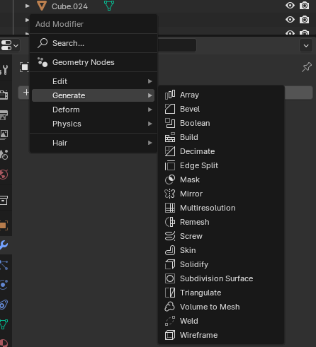
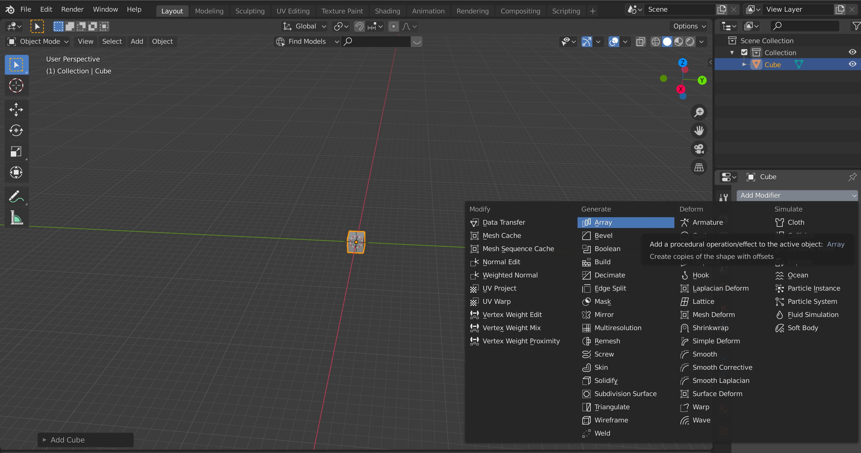
blender making it REALLY hard to continue using their software, who designed this change, i want the older layout back (bottom one is the old layout)


(https://quackers.gumroad.com/l/classic_modifier_menu)
Here you goIIRC The reason is that old layout is getting cluttered. It least the modifier is searchable now, which I think is a great improvement.
It’s just a muscle memory issue for me, keep hitting
SafterShift + A.thanks, id rather not click through multiple menus and i dont like using search when i dont even know what im looking for
deleted by creator
There’s a search now? I have been waiting for that for so long.
This is an awesome find thank you!!
to me its a clear improvement. it’s a small change but it reduces the previosuly overwhelming modifier panel to something easily digestible, and the search featuee actually makes it faster to use. I cant understand why you would be upset about something so minor even if you consider it a slight downgrade.


