Free demos on Itch: https://driftingskies.itch.io/drifting-skiesDrifting Skies is a turn-based strategy set during the golden age of sail. Following a calami...
I know it is ugly, but I’m a sucker for that sort of of odd historical stuff haha. All of my research has suggested that font to be reasonable, it was actually created from the work of a late 17 century Dutch printer. I also have a collection of reference books from the late 18th that use it in the same way.


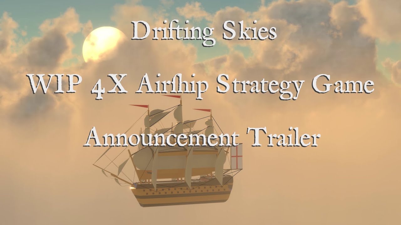
I know that the old cursive s looks like a lowercase f but it’s still pretty jarring in the trailer because usually it extends far lower.
I know it is ugly, but I’m a sucker for that sort of of odd historical stuff haha. All of my research has suggested that font to be reasonable, it was actually created from the work of a late 17 century Dutch printer. I also have a collection of reference books from the late 18th that use it in the same way.