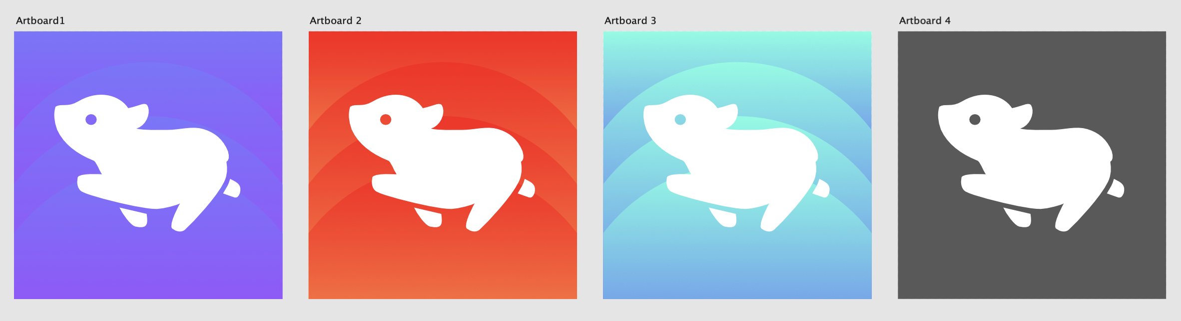
dizzy@lemmy.ml to Memmy - An iOS client for Lemmy@lemmy.mlEnglish · 1 year agoAnother app icon conceptlemmy.mlimagemessage-square22fedilinkarrow-up1100arrow-down14
arrow-up196arrow-down1imageAnother app icon conceptlemmy.mldizzy@lemmy.ml to Memmy - An iOS client for Lemmy@lemmy.mlEnglish · 1 year agomessage-square22fedilink
minus-squaresupermurs@lemm.eecakelinkfedilinkEnglisharrow-up15·1 year agoReally nice icons! I wish we could change the default one, the app is really good but I’m not really fond of the icon.
minus-squarekatzen@feddit.delinkfedilinkEnglisharrow-up8·1 year agoThey will add custom icons for sure soon.
minus-squaredemesisx@lemmy.worldlinkfedilinkEnglisharrow-up7arrow-down2·1 year agoI get that they’ll do it soon. But I wish that would be fixed ASAP. The original one was at least better than that new one which is the worst I’ve ever seen on an app this good.
minus-squarefer0n@lemm.eelinkfedilinkEnglisharrow-up1·edit-21 year ago100% agree. The app icon doesn’t reach the same standard that the app itself sets. Also I cannot unsee that it looks like a sex doll
minus-squaredizzy@lemmy.mlOPlinkfedilinkEnglisharrow-up6·1 year agoYeah I’m sure it’ll happen in time! The devs are working at a crazy pace getting the important stuff figured out first
minus-squarecyph3rPunk@infosec.publinkfedilinkEnglisharrow-up1·1 year agoundefined> I like the waveform effects in the third one understood but I feel like they’re trolling us, changing from a decent icon (albeit with white space on the sides) to an absolutely hideous one.


Really nice icons! I wish we could change the default one, the app is really good but I’m not really fond of the icon.
They will add custom icons for sure soon.
I get that they’ll do it soon. But I wish that would be fixed ASAP. The original one was at least better than that new one which is the worst I’ve ever seen on an app this good.
100% agree. The app icon doesn’t reach the same standard that the app itself sets. Also I cannot unsee that it looks like a sex doll
Yeah I’m sure it’ll happen in time! The devs are working at a crazy pace getting the important stuff figured out first
undefined> I like the waveform effects in the third one
understood but I feel like they’re trolling us, changing from a decent icon (albeit with white space on the sides) to an absolutely hideous one.