![Reddit Activity 08 - 28 June [OC]](https://lemmy.world/pictrs/image/26da7bca-cff6-4b5f-a983-22436545e922.png)
During the Reddit Blackout i made a graph showing the posts and comments/day (Link).
Some days ago i was asked to make an Update so here it is.
Source Data is from here and contains the same Data as some may know from here. Only difference is that the post and comment count is summed over the day.
EDIT:
The Original Post Data contained inconsistent Data points on each day (see here).
This is the corrected Chart, which uses the difference in Post IDs between the days to calculate the daily number (adjusted to s between the api calls):
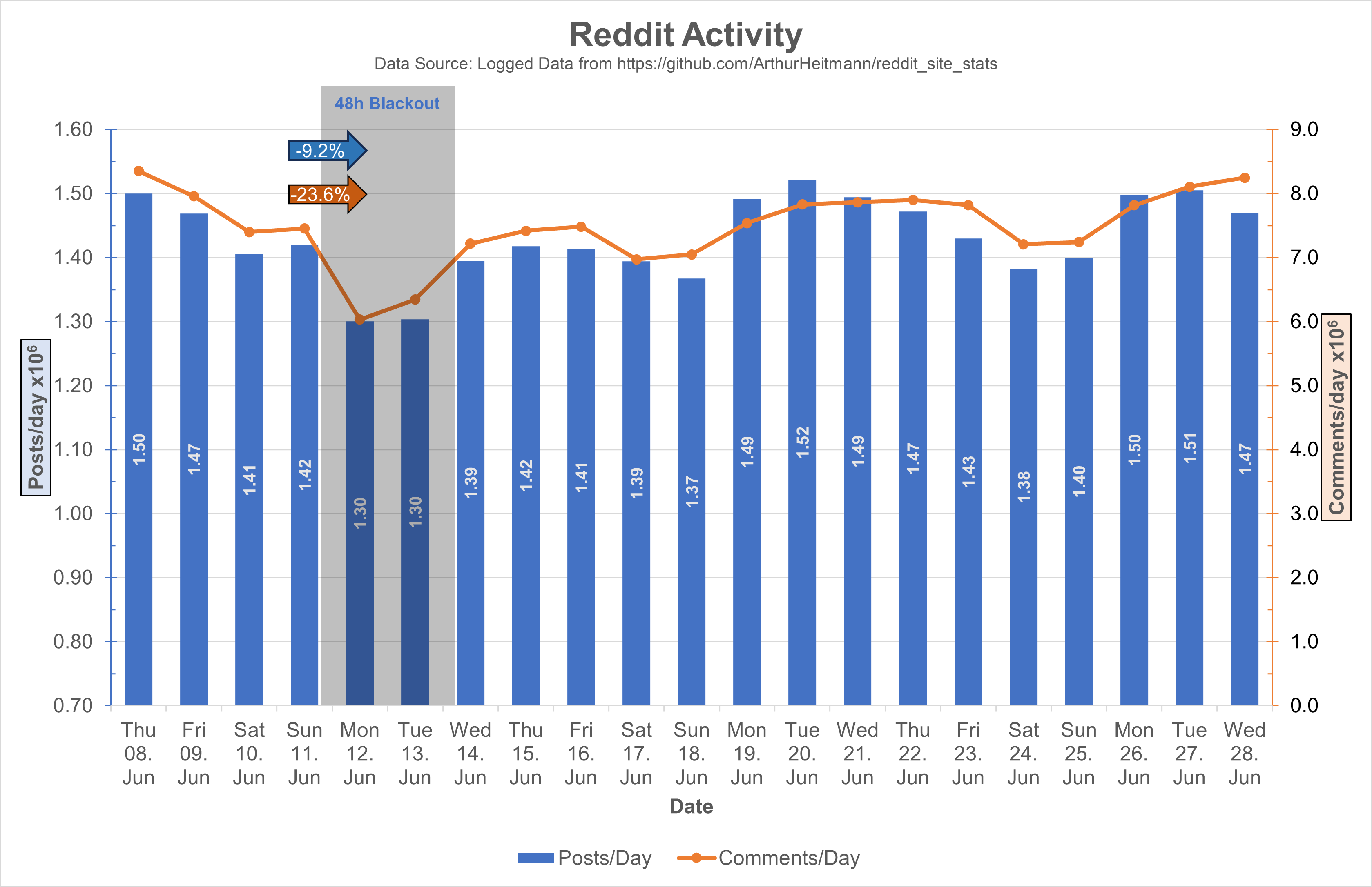
I also adjusted the values to 10^6 and adjusted the y-axis ranges, I hope this makes it easier on the eyes.
For people complaining on the mixed chart: Double column looks bad with 2Y-Axis, and double lines looks too empty. 2Y-Axis are necessary cause of the difference in scaling of the posts and comments data, only other option would be an axis break.
Wait, reddit has a follow feature? Who’d use that nonsense?
It had a follow feature since at least 2012, maybe earlier than that. Miami redditors used to have a lot of meetups and we thought it would be fun to follow each other to see what we were commenting on and what subreddit everyone frequented, but since you couldn’t see who was following you (at the time) it felt too much like stalking each other when we would bring up each other’s comments each week, so we all stopped. But when someone you were following commented somewhere you were reading, it showed a special icon. Now they’ve made it more like Twitter where you have a profile page and a feed and they notify you when someone follows you, but it’s all porn bots.