![Reddit Activity 08 - 28 June [OC]](https://lemmy.world/pictrs/image/26da7bca-cff6-4b5f-a983-22436545e922.png)
During the Reddit Blackout i made a graph showing the posts and comments/day (Link).
Some days ago i was asked to make an Update so here it is.
Source Data is from here and contains the same Data as some may know from here. Only difference is that the post and comment count is summed over the day.
EDIT:
The Original Post Data contained inconsistent Data points on each day (see here).
This is the corrected Chart, which uses the difference in Post IDs between the days to calculate the daily number (adjusted to s between the api calls):
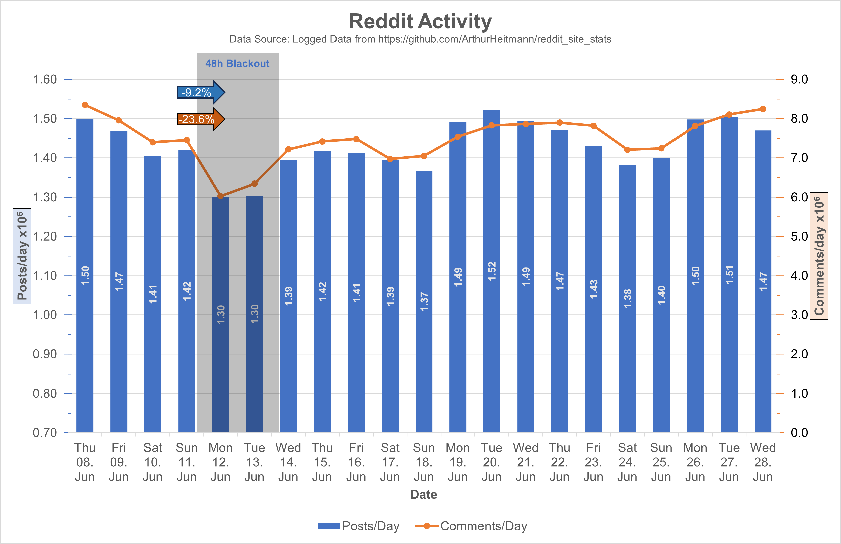
I also adjusted the values to 10^6 and adjusted the y-axis ranges, I hope this makes it easier on the eyes.
For people complaining on the mixed chart: Double column looks bad with 2Y-Axis, and double lines looks too empty. 2Y-Axis are necessary cause of the difference in scaling of the posts and comments data, only other option would be an axis break.
Going through your source you are hitting
commentsPerMinute.json for comment counts
As part of your reddit api pull, what reason do you believe this information is accurate and not falsified?
It would be very easy to do so.
https://github.com/ArthurHeitmann/reddit_site_stats/blob/9e70f7195339d00f0bd49e252a7ca3fe829da5f2/src/missions/CommentsPerMinuteLoggerMission.ts
Replying through my kbin since i can’t reply to kbin from lemmy.world right now for a reason:
It’s not actually my reddit api pull. As far as I understand the code, in a regular time intervall the newest post and comment are pulled to obtain the per minute data.
Not sure if that info is directly obtained from the reddit api, or if they use a comment/post ID to calculate the difference between each sampling point. Am not that good at coding myself.
But yeah i think that reddit could manipulate that data without issues.
There are some paying traffic monitoring sites that apparently showed a dip of 20% too (Reported here). They also report that the average time spent and session counts went down by 14% and 8%. Since this data is not obtained from reddit directly I think it might be a bit more representative