![Reddit Activity 08 - 28 June [OC]](https://lemmy.world/pictrs/image/26da7bca-cff6-4b5f-a983-22436545e922.png)
During the Reddit Blackout i made a graph showing the posts and comments/day (Link).
Some days ago i was asked to make an Update so here it is.
Source Data is from here and contains the same Data as some may know from here. Only difference is that the post and comment count is summed over the day.
EDIT:
The Original Post Data contained inconsistent Data points on each day (see here).
This is the corrected Chart, which uses the difference in Post IDs between the days to calculate the daily number (adjusted to s between the api calls):
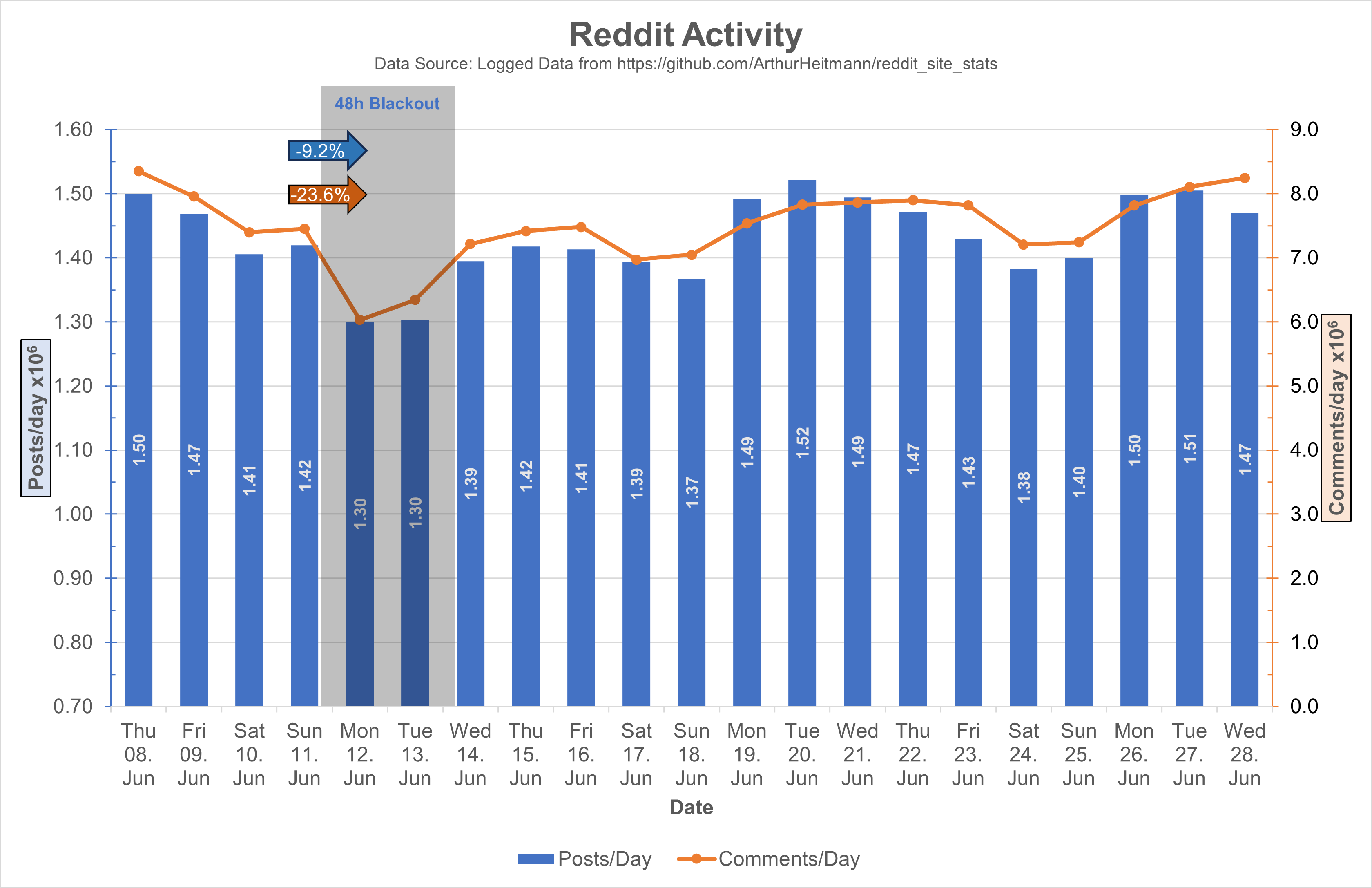
I also adjusted the values to 10^6 and adjusted the y-axis ranges, I hope this makes it easier on the eyes.
For people complaining on the mixed chart: Double column looks bad with 2Y-Axis, and double lines looks too empty. 2Y-Axis are necessary cause of the difference in scaling of the posts and comments data, only other option would be an axis break.
Though, I do kinda like the way it is rn. I mean, I hope for more communities & content someday. But, the vibe here is so calm & courteous atm. Like the best & kindest ppl are here now.
Idk… I like all you guys, ig. Lol. It’s just nice rn 😌
Agreed! Everyone is chill here, it’s not just a bunch of karma whores, bots, and assholes dominating everything.
It’s so chill. The askKbin threads are full of such honest answers at the moment, not something trying to always be a joke or make a pun.