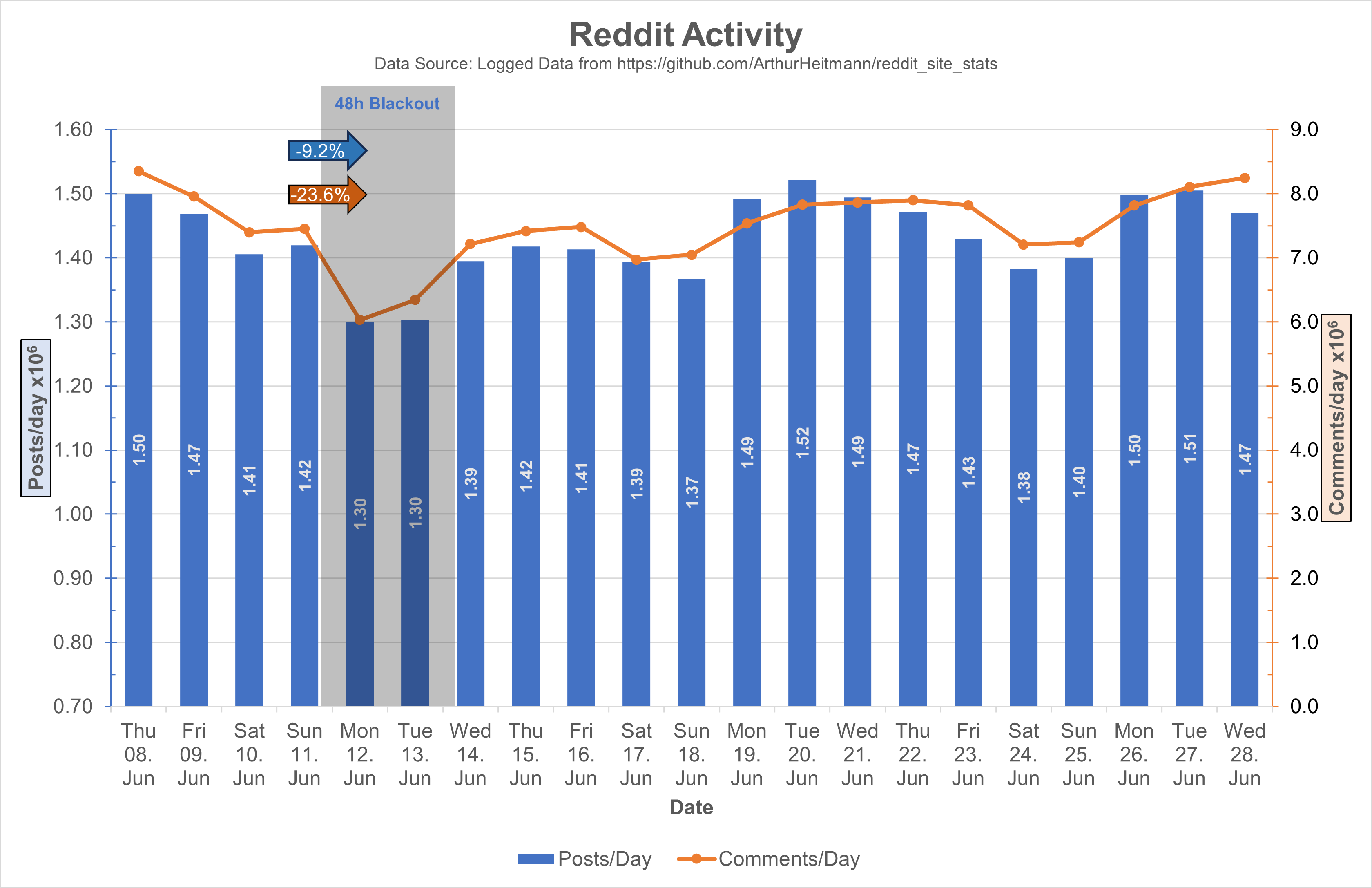
During the Reddit Blackout i made a graph showing the posts and comments/day (Link).
Some days ago i was asked to make an Update so here it is.
Source Data is from here and contains the same Data as some may know from here. Only difference is that the post and comment count is summed over the day.
EDIT:
The Original Post Data contained inconsistent Data points on each day (see here).
This is the corrected Chart, which uses the difference in Post IDs between the days to calculate the daily number (adjusted to s between the api calls):

I also adjusted the values to 10^6 and adjusted the y-axis ranges, I hope this makes it easier on the eyes.
For people complaining on the mixed chart: Double column looks bad with 2Y-Axis, and double lines looks too empty. 2Y-Axis are necessary cause of the difference in scaling of the posts and comments data, only other option would be an axis break.

Be interesting to see what happens between this period and over the next month. I made the switch today and I’m sure many more are doing also.
Welcome! :)
Same with me - just joined a few hours ago! It would be great to see a viable community-run alternative to Reddit and other online services.
Especially when 3rd party apps stop working.
Yea i wonder if it does happen how much of a panic reddit is gonna be in, cos it cant reflect positively on their IPO. I hope they get screwed
Too many of my favourite communities are still yet to make a switch, but I sure as hell hope they do! r/crowbro would make an excellent addition to lemmy.