Arctic is a (much) better Lemmy client than any other out there for iOS at least but there are some nifty features for the most recommended app Voyager like the ability to disable side swipes altogether because Apollo’s (reddit) double-tap to upvote for example is much intuitive where side swipes are used to enter and exit communities, posts, comments, menus, settings… or whole app together on Android or Jailbroken devices.

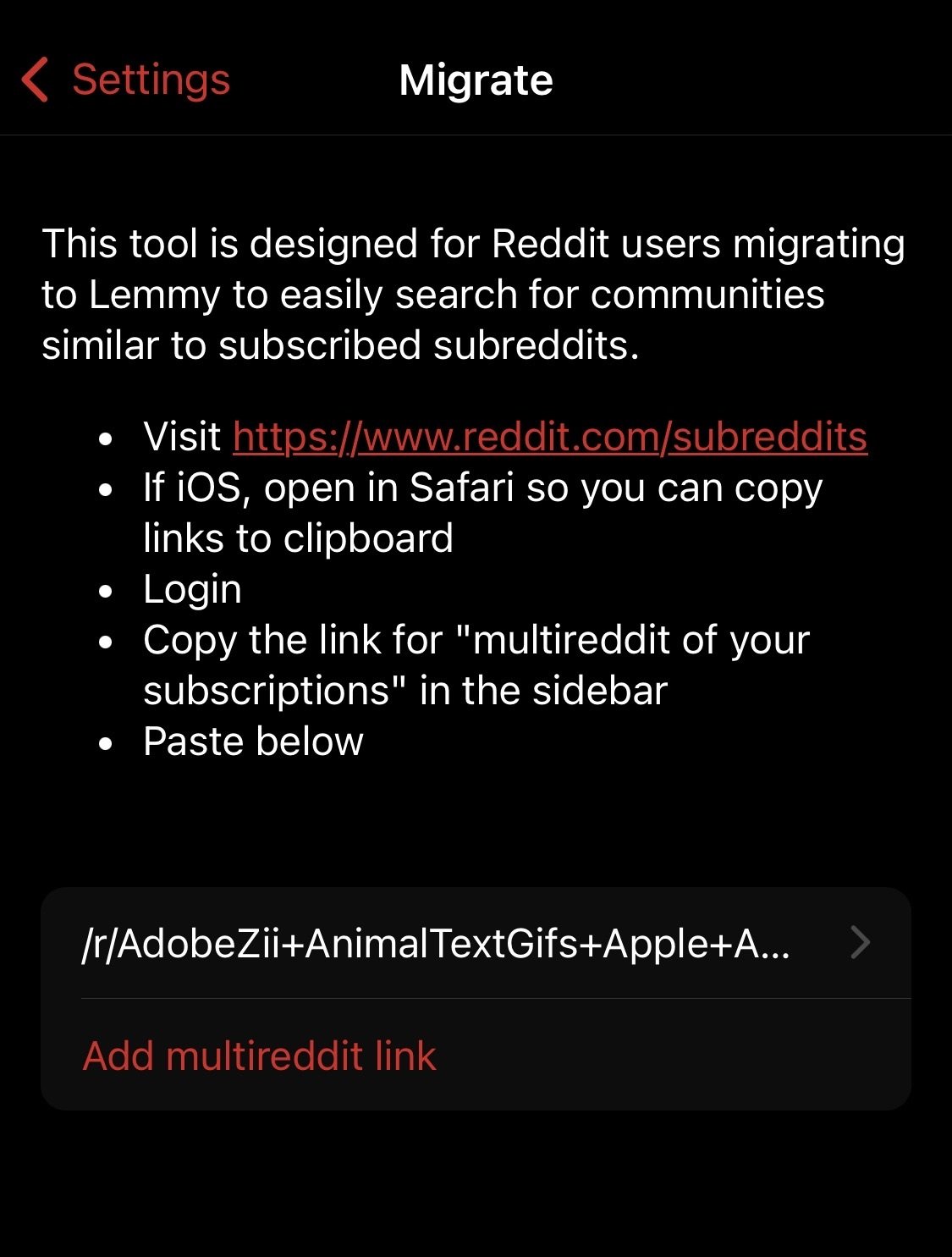
This is my multireddit link after removing u/user which were included as r/_u/redditor from an existing bug to test this for Arctic which would fully enable me along with a lot of us to leave Voyager behind.

  • Avieshek@lemmy.worldOP
    link
    fedilink
    English
    arrow-up
    0
    ·
    22 days ago

    I am glad and nice to meet you, after witnessing your dedication first hand I would also like try my part in bringing more exposure to your client here on forward and I hope my feedback can also bring forth the same support from others. If it’s preferable, we can directly interact in DMs to keep tab of everything at one place and would be happy to contribute.

    1. Only exiting an app itself is not default on iOS with side swipe gestures but for navigating through different layers of menu has been standard for ages including the Reddit app itself. The swipe actions on cells is something more seen on email clients like Spark or Mail itself if not Gmail but there’s a huge difference between public comment threads and your inbox, this is something more suitable for chats or messages.
    2. I was only introducing the idea to see past through existing implementation of repeated taps where you may even implement triple tap for example to collapse comments or use the same haptic touch to open the menu and then select the collapse option at one go without lifting your thumb as has been recently being explored by Threads and Instagram app beautifully. Am sure am not the only one (I have read quite a thread of user annoyances on support forums regarding this) but the default behaviour of swipe gestures lead to random upvote-downvote, archive to block triggers - this is the numero uno 1 complaint of all Lemmy users and am only saved by drawer style offered by Arctic however it still adds friction. Voyager only sparingly addressed this by adding a toggle to disable side gestures but without an alternative at place like the double tap I have suggested that exists from Reddit to Instagram. If your app is the one that properly addresses the feedback I bring forth to you which are the the no. 1 complaints of users transitioning to Lemmy then this can easily become the no. 1 client to the point of setting how things (like default behaviour) should be at Lemmy after Voyager.
    3. There’s no use in configuring the ones on the right if the left ones are a non-interactive element, can’t they made to be interactive? I don’t mind if the voting buttons are on the right but my point was to integrate both interactive and non-interactive element into one and open up space to lessen the weight of ••• for common actions.
    4. That’s why the implementation of earlier is important as in a step-by-step process, there’s no third-step without second-step in place.
    5. Simply make it easier to differentiate posts from the comments, the captions and attachments in the posts, and the parent comment from another parent comment so it isn’t confusing with replies if two people are arguing and am only interested in reading about the topic on hand for example.
    6. Thank you.
    7. I actually aware where the edit option for communities are but unlike the desktop site for Lemmy.World, if your description has more than three lines on the viewable pane making use of the 5000 word limit with community rules, headers, bullet numbering etc then you’d understand what am to talk about. Simply try to put and then edit your previous reply am responding upon in a community description through your client.
    8. I will not argue on this and rather suggest exploring different hue of blue like your app icon at least and match the comment thread colour with the theme they’ve opted like Fiery Red should be automatically implemented if that the theme they enabled.