

Edit: This link is outdated, see new poll here https://programming.dev/post/190520
Hey everyone
Wanted to run a poll about the community icons to choose between a couple options
Option 1 - Use UBP icons - Use unified icons for all of the communities similar to beehaw

Option 2 - Use UBP for general communities and specific language, etc. icons for specific communities
Option 3 - Dont use UBP icons
Vote using the strawpoll here (doing strawpoll so it can be ranked voting) [removed in favor of new post]
EDIT: I have remade the poll with two more options. If you voted in the previous one please vote again in this. The new options are just for adding different colored gradients to the unified icons for different communities
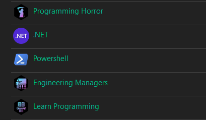
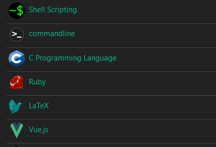
Quick example of this:
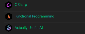
Wow, the multi color gradients per different community is rather clean, but still aids in rapid legibility. Still think shape masking should be left to the user’s chosen theme or client side rendering, but the neon on black is warming up to me.