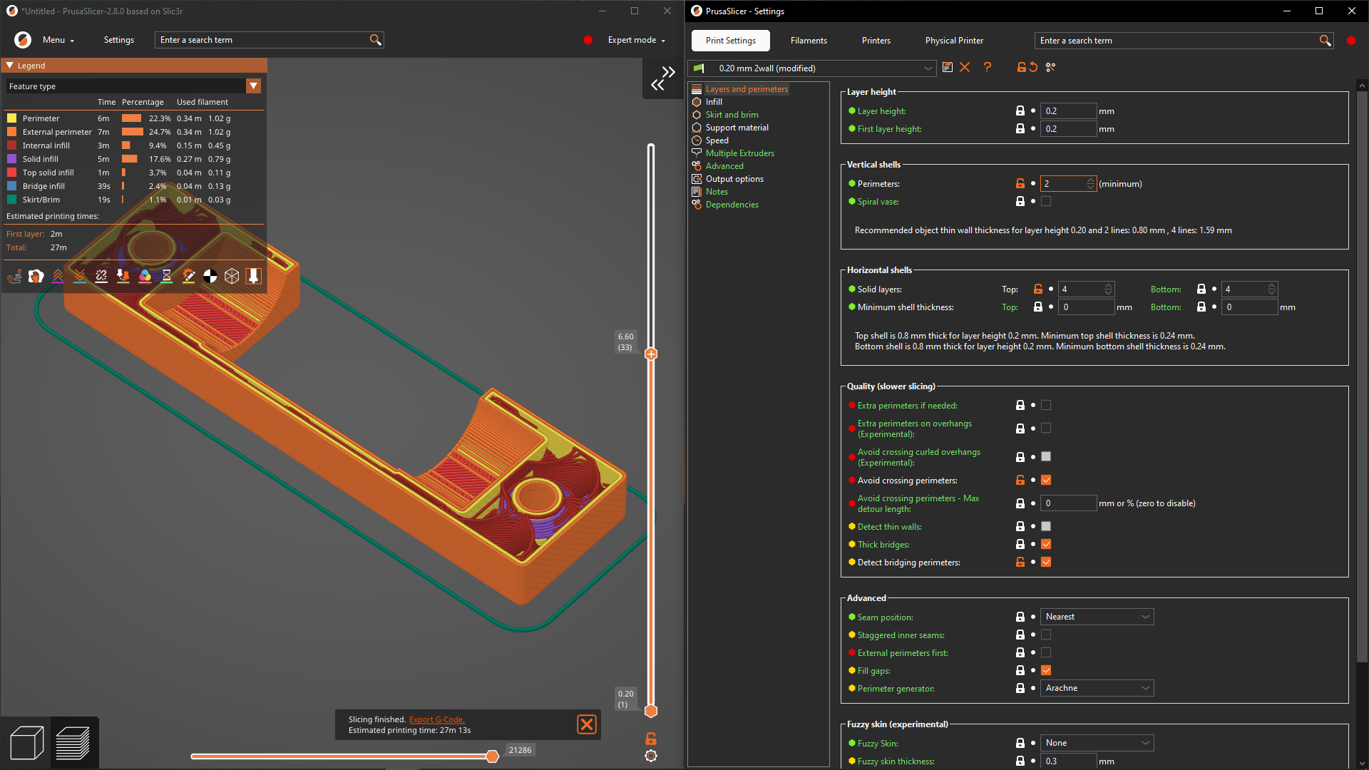
Screenshots of the UI changes on the Mac - in my opinion it is now just wasting a lot of screen estate for zero benefit.
On non-Macs they’re adding an extra usability issue by hiding the top menu bar. I’ve gove back to 2.7.4 for now - fortunately I had my configuration in git.
Up to 2.7.4:

2.8.4:

On pc there is a setting to revert to old menu bar appearance.
On Windows: I hate it too.
Takes up more space without any benefit. this version looks “modern” but from a usability standpoint, it is worse.
Hope Prusa goes in and makes the toolbar (Menu, Platter, Print Settings, filament, Printers, physical printer) small/less height and gives the buttons something to make them look like a button. Right now it is just text on a grey background. Big steps in the wrong direction in my opinion as it stands but easy to fix.
The addition of the physical printer page/tab is nice. Now I can view the Duet web interface directly in prusaslicer. While the printer are 99% upload and forget from time to time I need to view the control panel to check or adjust a thing or two.
Takes up more space without any benefit. this version looks “modern” but from a usability standpoint, it is worse.
Gnome 3’s guiding philosophy
And CLion’s new UI… and Cura slicer… and discord with default settings… and most websites… it seems to be a cornerstone of “modern” UI design, and personally I hate it too.
I like the new design more but agree the menu height should be smaller or adjustable.
And on Linux it looks even less native now
There is some good stuff in this release. Go to Preferences > GUI and check “Show sidebar collapse/expand button” + “Settings in non-modal window”. Now you can put the Preview and Print Settings windows side-by-side, and see the result of every change immediately. This also requires “Background processing”, but that’s been available for ages.

Does Apple lack a feature to turn off or hide the file menu?
I don’t recall if I custom bound mine or if GNOME defaults to, but I never see those old things unless I press F10.
I agree that it is not very pretty having all three of those bars in growing redundant nonsense. Tiling frames are like desktop icons IMO; very retirement-center historical-preservation aesthetic design, but we’re talking about desktop environments at that point, not the app dev. Apple wants things to be their little aesthetic way to monopolize, so they intentionally make decisions that erode the usefulness of outside package standards.
Does Apple lack a feature to turn off or hide the file menu?
I have no idea. They decided to put a notch with the webcam in the middle of the screen, so I’d not be able to use that space properly with anything else anyway.
My point here wasn’t about mac, though (it was just handy for doing the screenshot at this moment , though it’s my least used platform for this: I had it upgraded, and as I have no intention of upgrading it on my Linux system after that experience I made the screenshot before the downgrade) - my point was the needless waste of space in the newer PrusaSlicer, which applies on all platforms.
To my knowledge the only way to “turn off” the menu bar is to run a program in full screen mode on a mac.
Honestly I’d just stick to orca slicer


