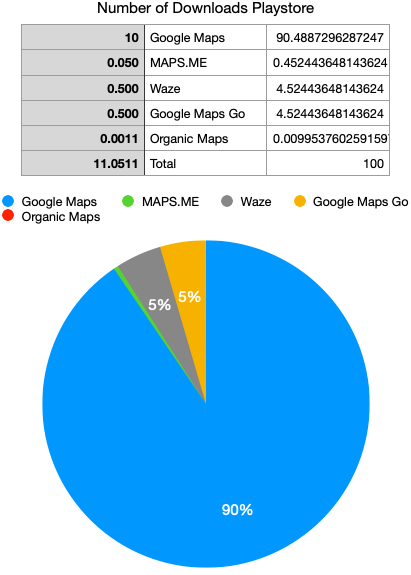
Number of Downloads:
Google Maps 10b (90.4%)
Maps Me 50m (0.4%)
Waze 50m (0.45%)
Google Maps Go 500m (4.5%)
Organic Maps 1.1m (0.009%)
Total: 11.05b
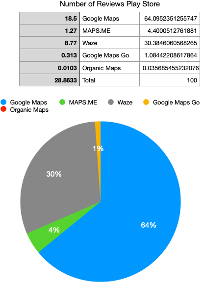
Number of Reviews Play Store:
Google Maps 18.5m (64%)
Maps Me 1.27m (4.4%)
Waze 8.77m (30.3%)
Google Maps Go 313k (1%)
Organic Maps 103k (0.03%)
Total: 28.8m
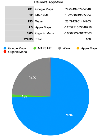
Number of Reviews Appstore:
Google Maps 731k (74.6%)
Maps Me 12k (1.2%)
Waze 233k (23.7%)
Apple Maps 2.5k (0.2%)
Organic Maps 85u (0.08%)
Total: 979.35k
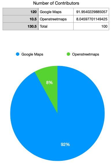
Number of Contributors:
Google Maps 120m (91.9%)
Openstreetmaps 10.5m (8%)
Total: 130.5m
Community Size on Lemmy
Organic Maps 318u (55.3%)
Apple Maps 257u (44.6%)
Total: 575u
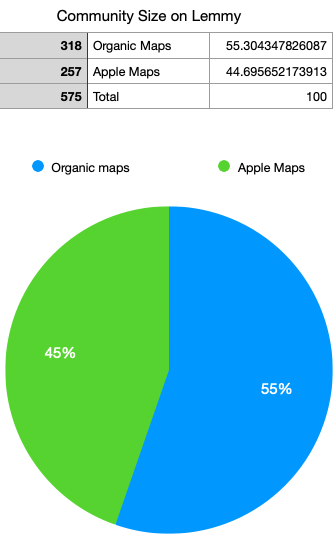
Edit 1: fixed the inconsistency of the numbers placement.


That includes people who have made like 5 reviews, you should redact that graph as it is heavily skewed and doesn’t mean anything unless it is accurate
All of these graphs don’t make a lot of sense. Apple maps is preinstalled on apple devices, so I guess that’s why they don’t review it. Last time I used gapps on android gmaps was included in all packages except the smallest one, it’s also preinstalled on most android devices so I don’t understand why some people would review it, but not apple maps on the other platform? On the play store chart, gmaps is only those who doesn’t have it preinstalled but downloaded it manually, or it includes everyone?
And comparing 2 lemmy communities by number of subscribers not by active contributors?
It was a good exercise about how to create pie charts in excel, and grats for that OP, but doesn’t give a lot of info. I don’t want to sound harsh, it’s a constructive criticism, keep creating charts! But don’ use pie charts for these kind of data. I would be interested in an updated version with more options included, fixed spelling of osm, a bit more explanation and more fitting type of charts.