Hey folks!
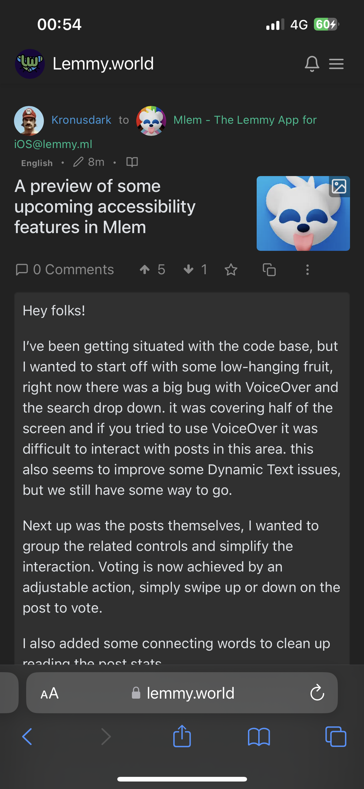
I’ve been getting situated with the code base, but I wanted to start off with some low-hanging fruit, right now there was a big bug with VoiceOver and the search drop down. it was covering half of the screen and if you tried to use VoiceOver it was difficult to interact with posts in this area. this also seems to improve some Dynamic Text issues, but we still have some way to go.
Next up was the posts themselves, I wanted to group the related controls and simplify the interaction. Voting is now achieved by an adjustable action, simply swipe up or down on the post to vote.
I also added some connecting words to clean up reading the post stats.
Saving is not yet fully supported, but I went ahead and cleaned up the interaction in anticipation.
Up next is posting and commenting, We will have some videos to share once those are ready.
Looking forward to making Mlem the most accessible iOS app for interacting with Lemmy!
– Weston, UX Engineer/Accessibility Specialist
The Mlem Team
Where do we swipe up/down on a post to vote? Doesn’t that just scroll the page?


these type of posts are broken on the app right now… no text is visible
I removed the image, thanks for reminding me. This is currently in our backlog to fix for the next release.
All i see is the icon. Am I missing something?
I removed the icon, there is a bug in mlem right now that won’t show text for an image post. its in our backlog.
This is the update that is helping replace Apollo. For some reason compact posts help me so much, it’s hard without it. Amazing app, thank you❤️
Agreed. I love compact posts. I am looking forward to hopefully being able to change the icon to something else eventually. I assume that’s planned. Then if we could just change the name of the app too… I’m guessing that won’t happen but I’d love for it to be something more pronounceable without sounding like an idiot
The icon swapping is definitely planned, and Clay has already got some great ones lined up for whenever that feature is able to be added.
“Mlem” (em-lemm) is cute, I think.
I assumed it was pronounced like it’s spelled with one syllable. Like people typically use it in the context of a cat licking something https://en.wiktionary.org/wiki/mlem
This is the intended pronunciation


